SeekU Coach Dashboard
Project Overview
SeekU is developing technology that guides students step-by-step through the college admissions process and gives them on-demand access to college counselors (“Coaches”). SeekU is focused on helping students develop the self understanding and sense of purpose necessary to do well in both the admissions process and beyond. Our team was brought on to create a comprehensive onboarding experience and coach dashboard.
The Problem
There is no onboarding system welcoming new SeekU coaches. Experienced SeekU coaches and new ones alike are finding it hard to balance the various software, information, and curriculum.
Team
My Role
Young Han Kim - UX Design Lead, Researcher
Lauren Alejo - UX Research Lead
Angela Newman - Project Manager, Client Liaison
Team Goals
Understand the company and the workflow for coaches
Maintain harmony by consistently communicating with SeekU staff and team
Design a platform which streamlines workflow for SeekU coaches from onboarding and beyond
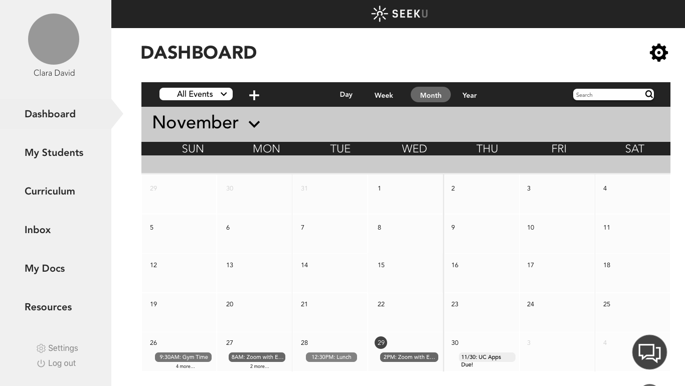
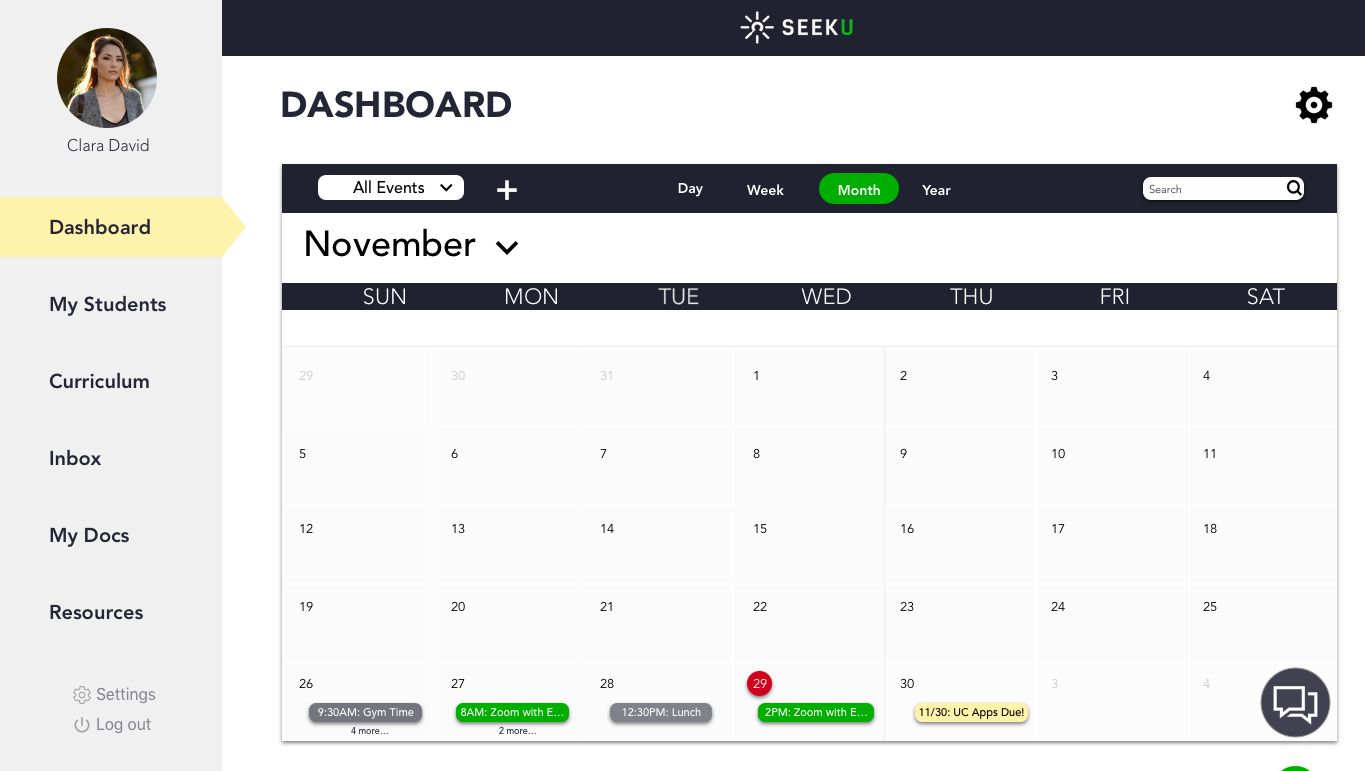
I led the design of the coach dashboard as well as its information architecture. I helped my team with the user interviews and usability testing.
Tools
Skype, Zoom, Whiteboard, Graph Paper, Sketch App, Illustrator, Photoshop, InVision, Google Drive
Phase I: Research
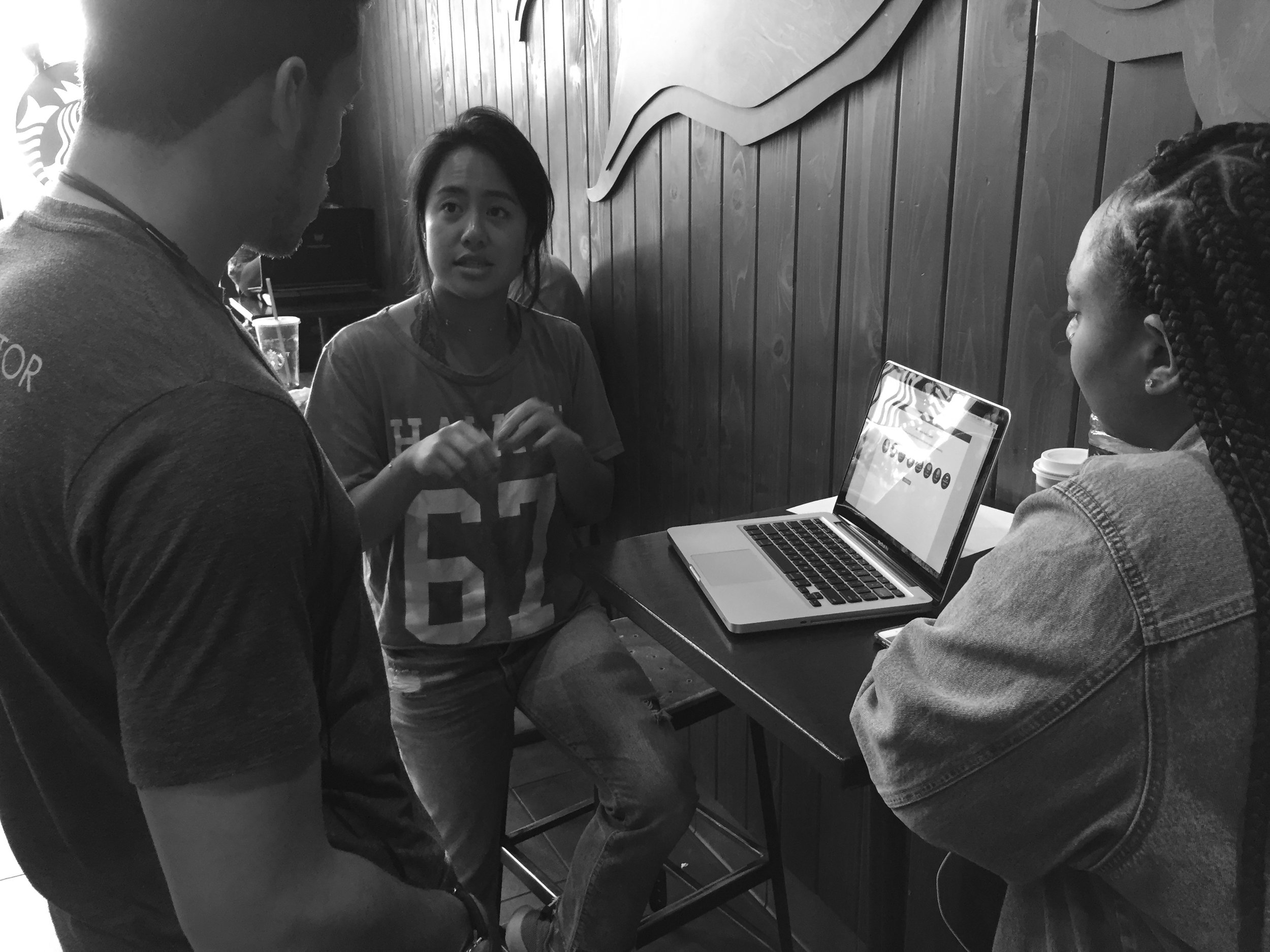
User Interviews - Contextual Inquiry
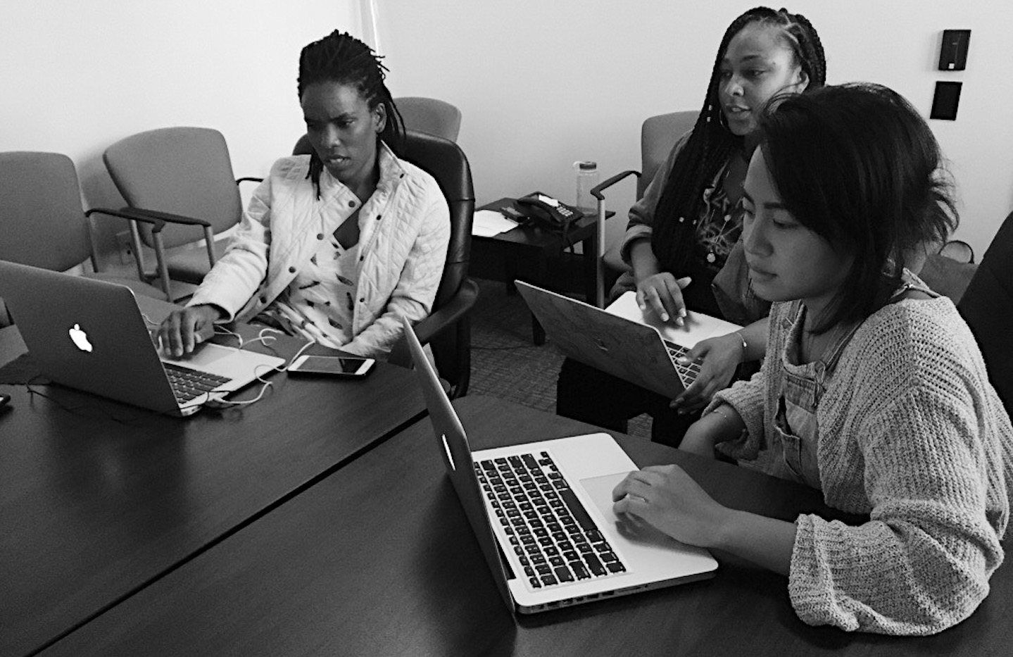
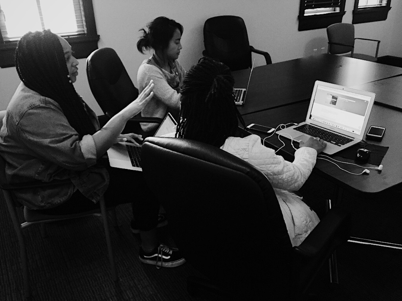
Based on a few interviews and a contextual inquiry, we gained insight on SeekU and their coaches' workflow.
With the feedback received, we began brainstorming solutions to the frustrations SeekU coaches had and created a...
User Journey Map
By creating the journey map, from when a session is booked by student to its completion, we found SeekU coaches juggle many apps at once during a session.
Proto Personas
Persona for new SeekU coaches (6 months or less)
Persona for experienced SeekU coaches (7 months or more)
To understand our end users better, we created personas based on the insights gained during the interviews. Moreover, we produced these personas to generate empathy as we began brainstorming solutions for both new and experienced SeekU coaches' pain points.
Phase II: Design
Design Lab
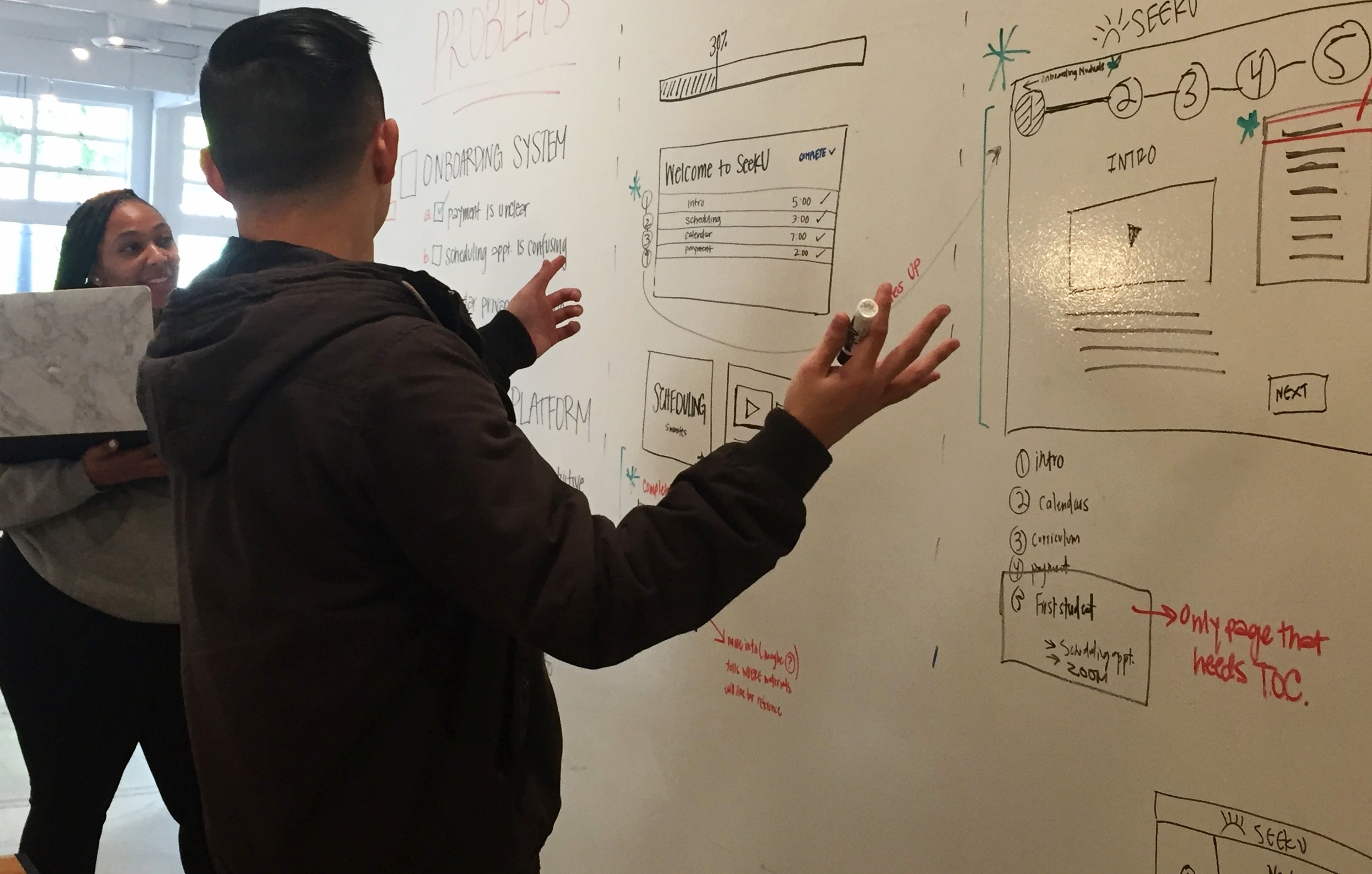
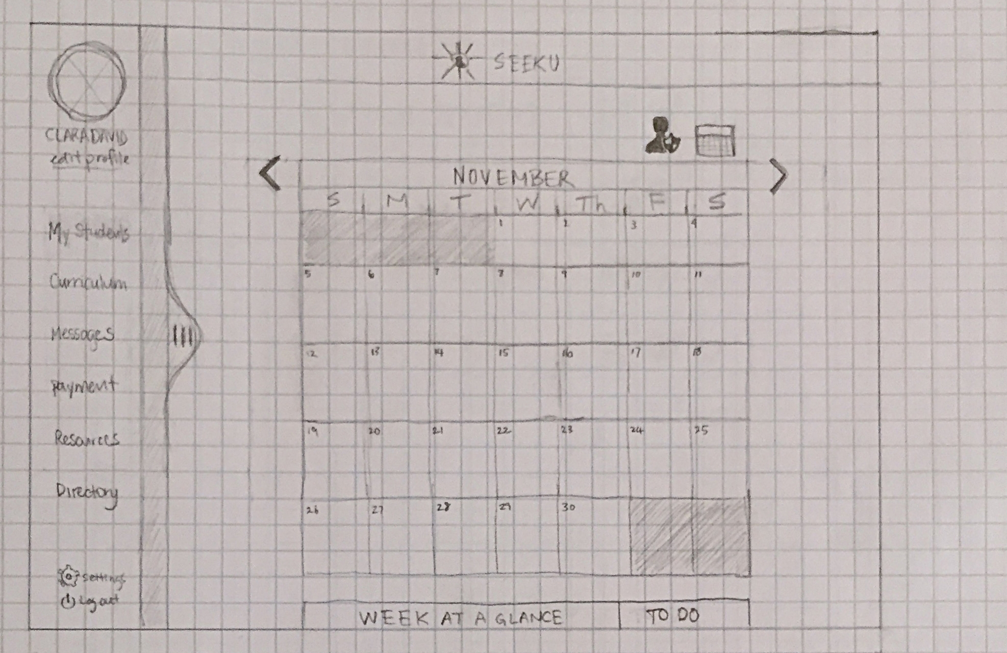
We ideated a step-by-step onboard experience and a dashboard supplying tools and apps so that SeekU coaches and staff are all on the same page, pun intended.
Phase III: Prototyping
Wireframes
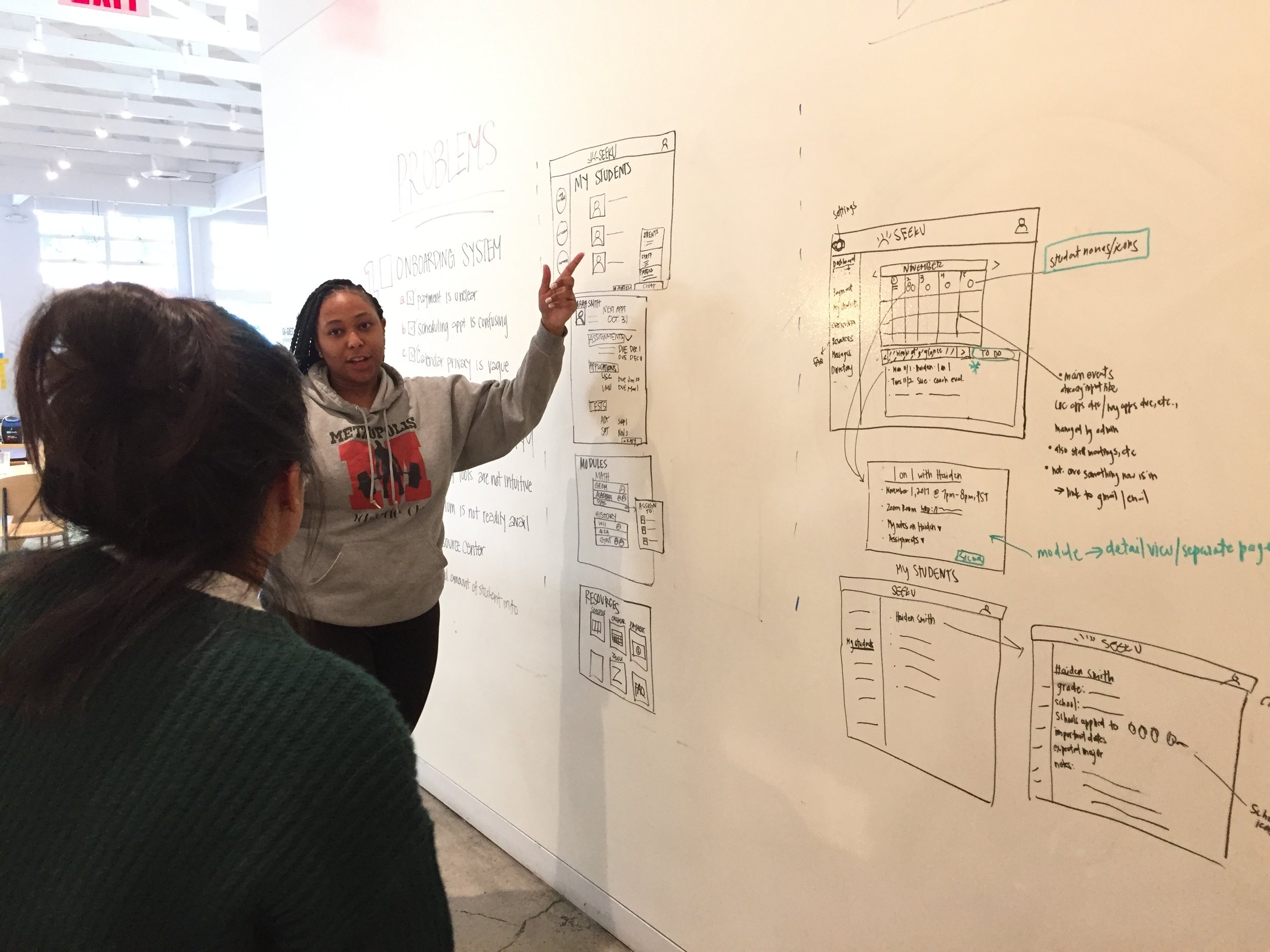
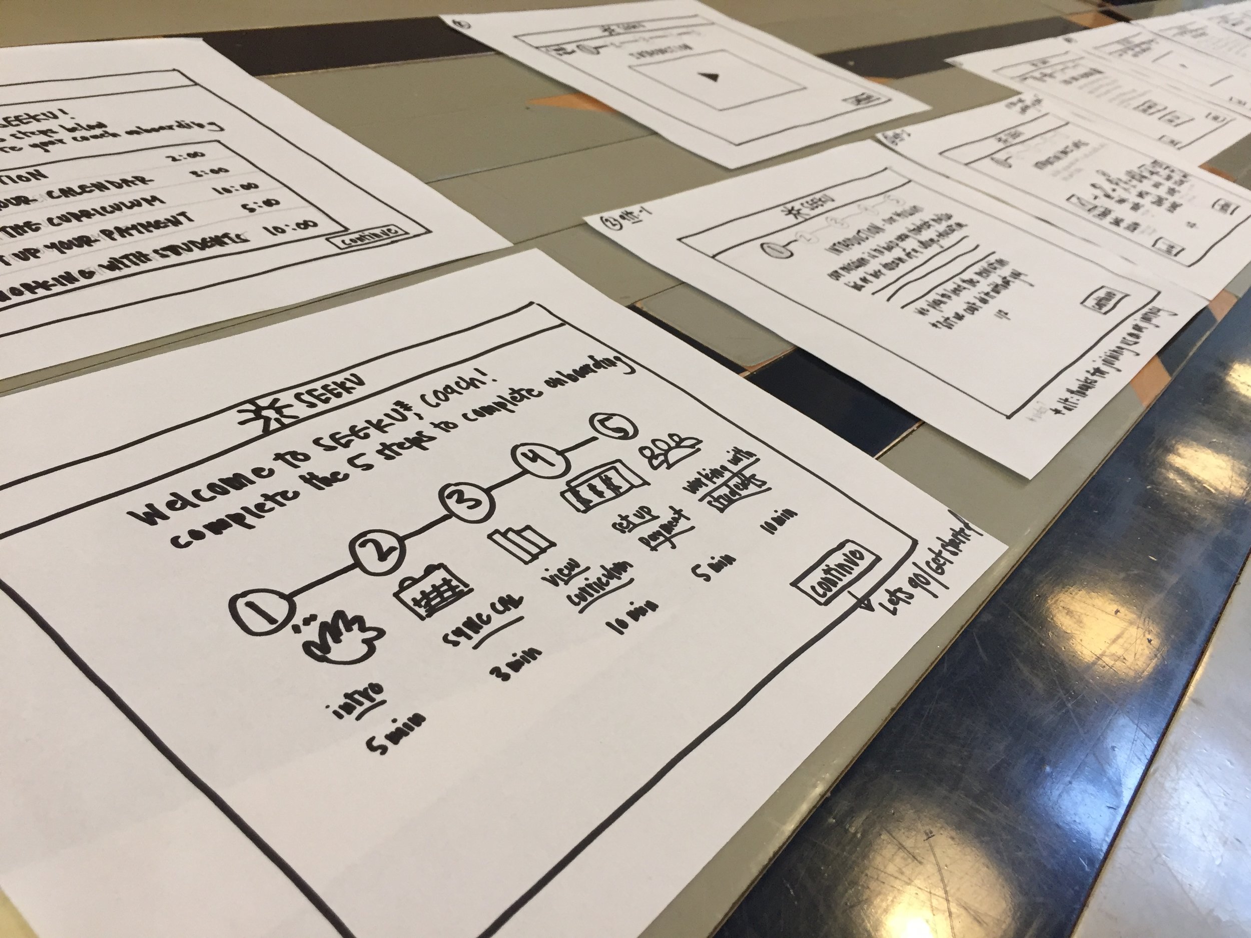
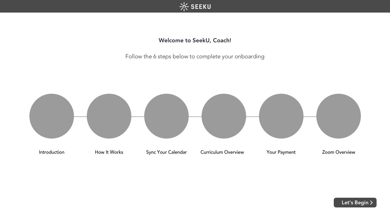
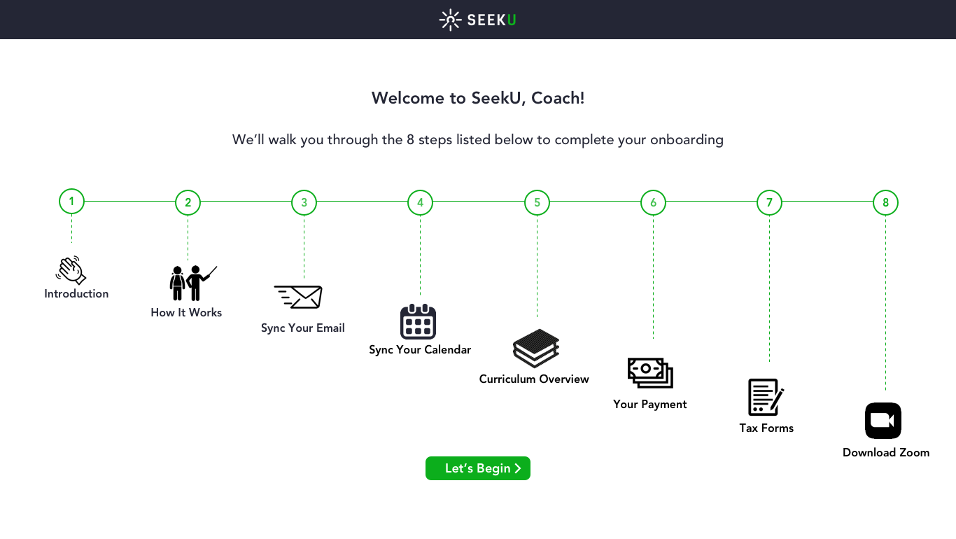
Our wireframes evolved from sketches on paper to high fidelity on Sketch. We tested our medium fidelity on users to knead out any kinks.
Usability Testing
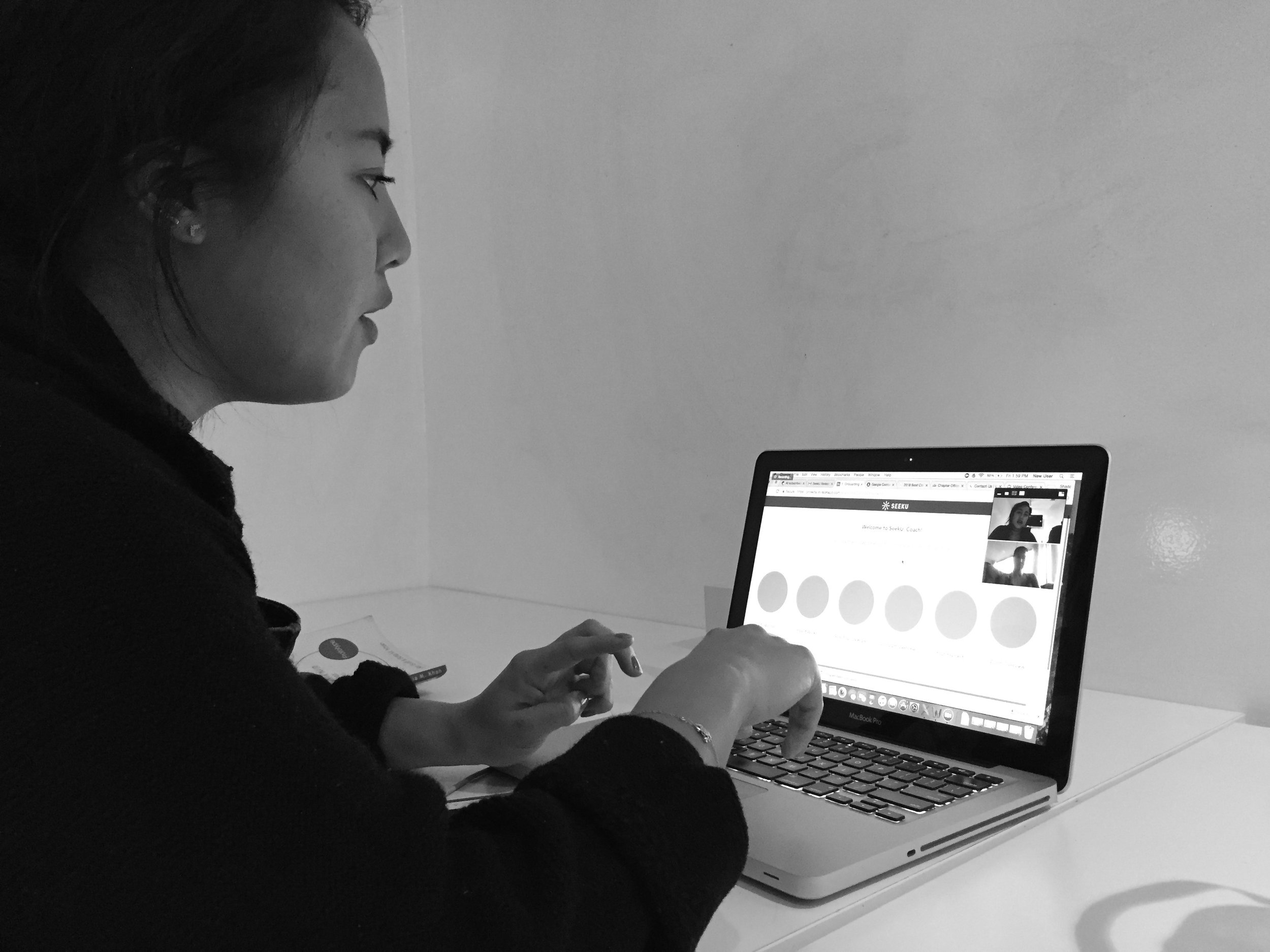
It was crucial to test our wireframes and receive feedback from users, we wanted to create a seamless onboarding experience as well as a streamlined dashboard.
Next Steps
Continue testing the screener for onboarding and educator platform with users.
Further improve the calendar and integrate a notification system.
Create an Admin platform, mimicking this platform, for SeekU community advisors and founders.
Design and test a mobile app for the onboarding screener and for the educator platform.


