Disclaimer: I was not hired by Adobe or any company to do this project.
Storyboarding in Virtual Reality (VR)
Synopsis: Project Overview
I was part of a team, with two other individuals, in which we researched and prototyped a speculative mobile VR feature for Adobe Story CC. Adobe Story CC allows the user to write, collaborate, and use scripts to generate schedules and production reports.
Team
Young Han Kim - UX Research Lead
Etaih Van Herwerden - UI Design Lead
Aili Jiaravanont - Project Manager
My Role
I led and oversaw the user interviews and usability tests. I also helped design wireframes and create the prototype.
Tools
Team Goals
Whiteboard, graph paper, Sketch App, Adobe Photoshop, InVision, Google Drive, Skype (Interviews)
Innovate the traditional storyboarding process
Create a mobile VR app in line with Adobe Story's brand
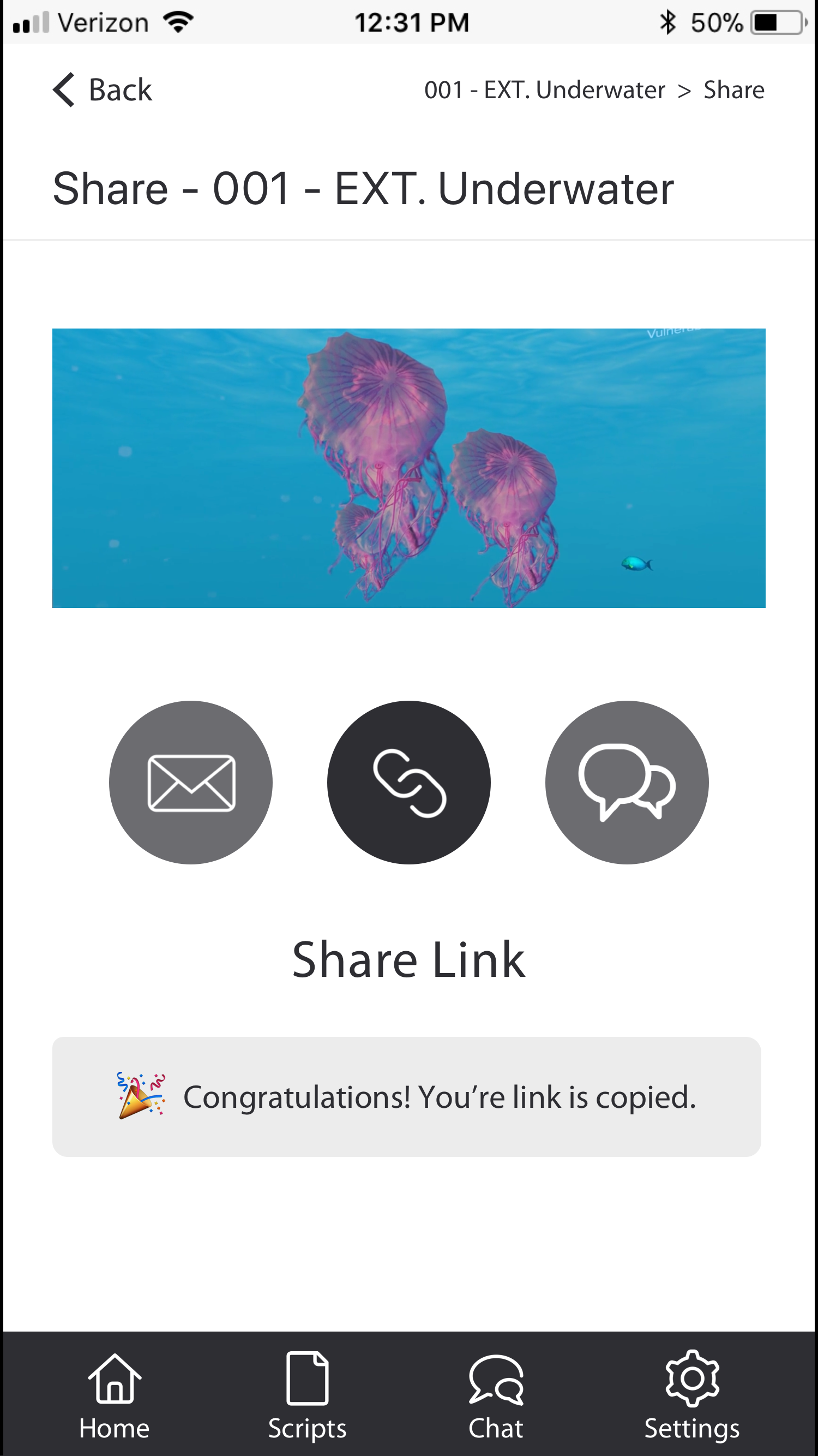
Give users the ability to collaborate and share with ease
The Problem
Can you envision writers using VR as a storyboarding tool? How?
Can VR be used as a space to store inspirational images, texts, scenes, places, character details, and video?
Can these details be knitted into a web of three-dimensional storytelling fabric? Can it be collaborated by multiple users?
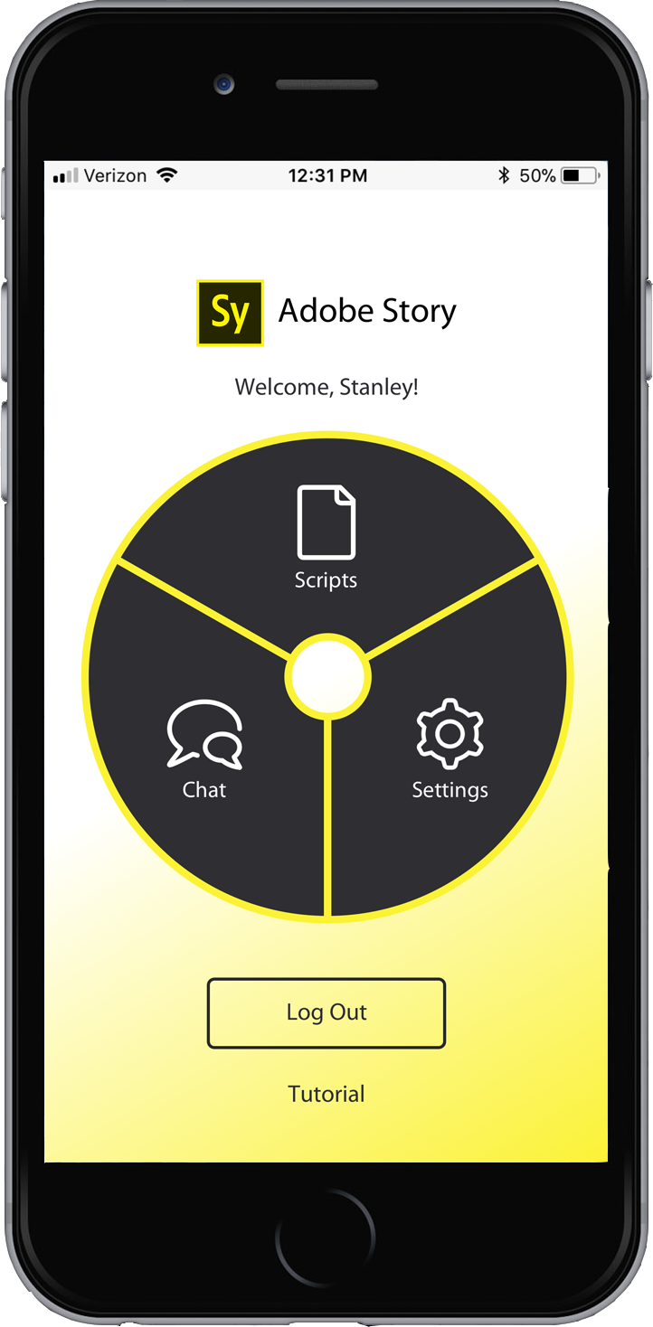
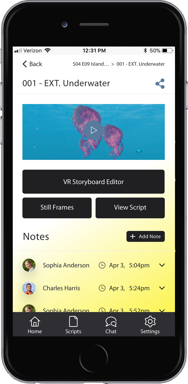
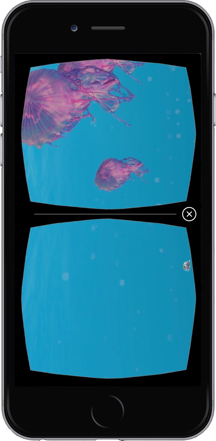
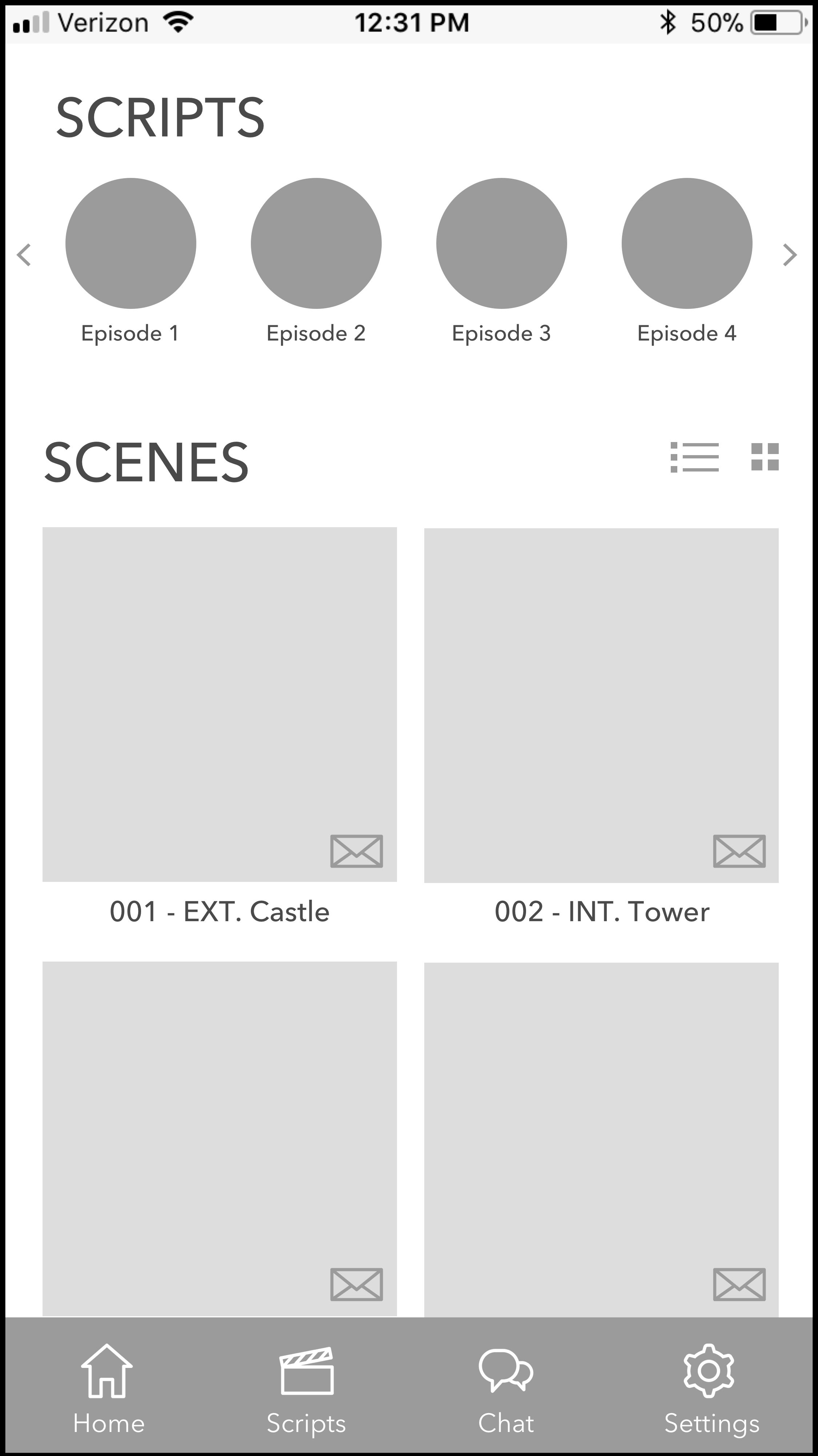
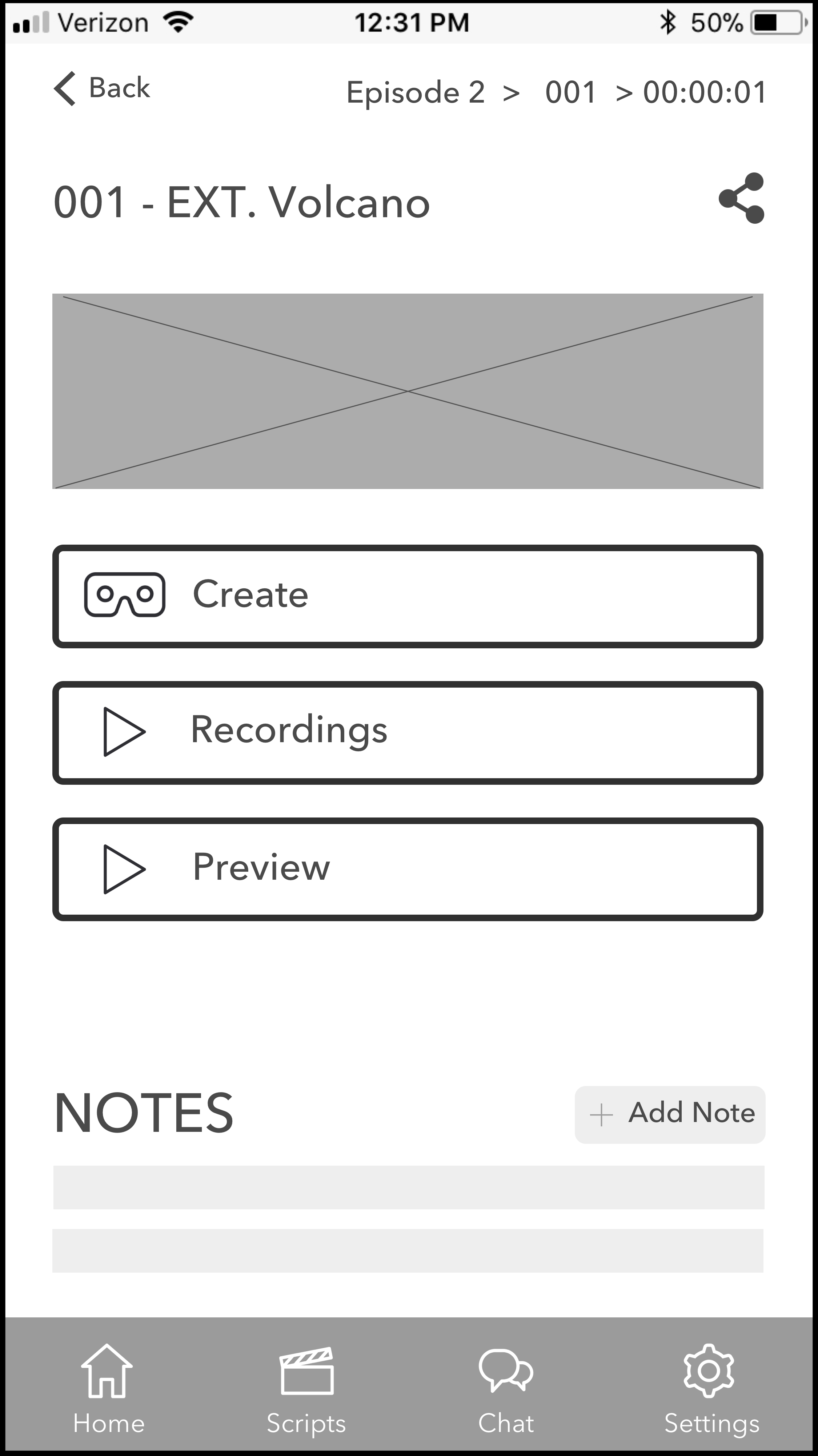
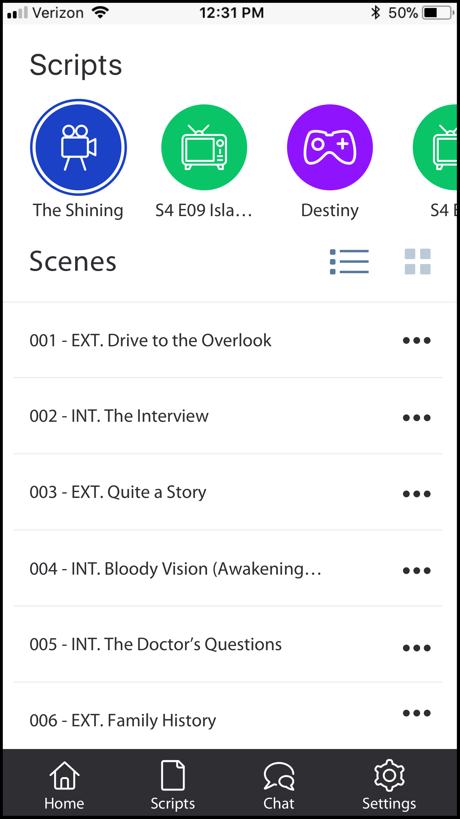
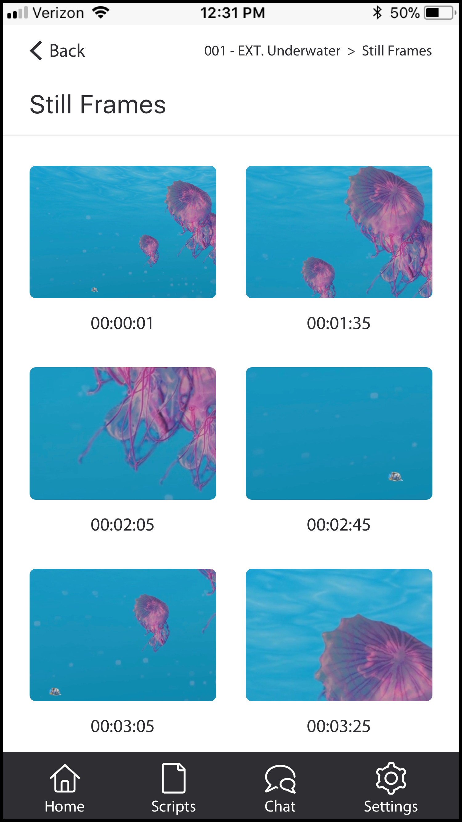
Below is the high fidelity wireframe as well as a link to the clickable prototype...
Act I: Research
We wanted to build empathy with our users, so after extensive USER INTERVIEWS with VR experts, film directors, screenwriters, and producers, we created a PROTO PERSONA.
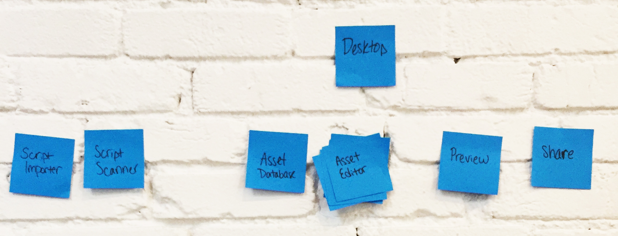
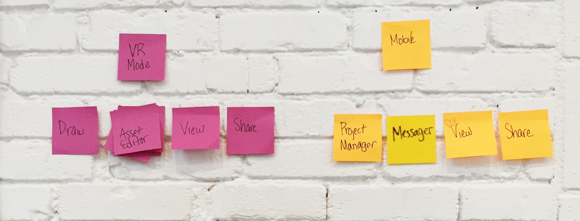
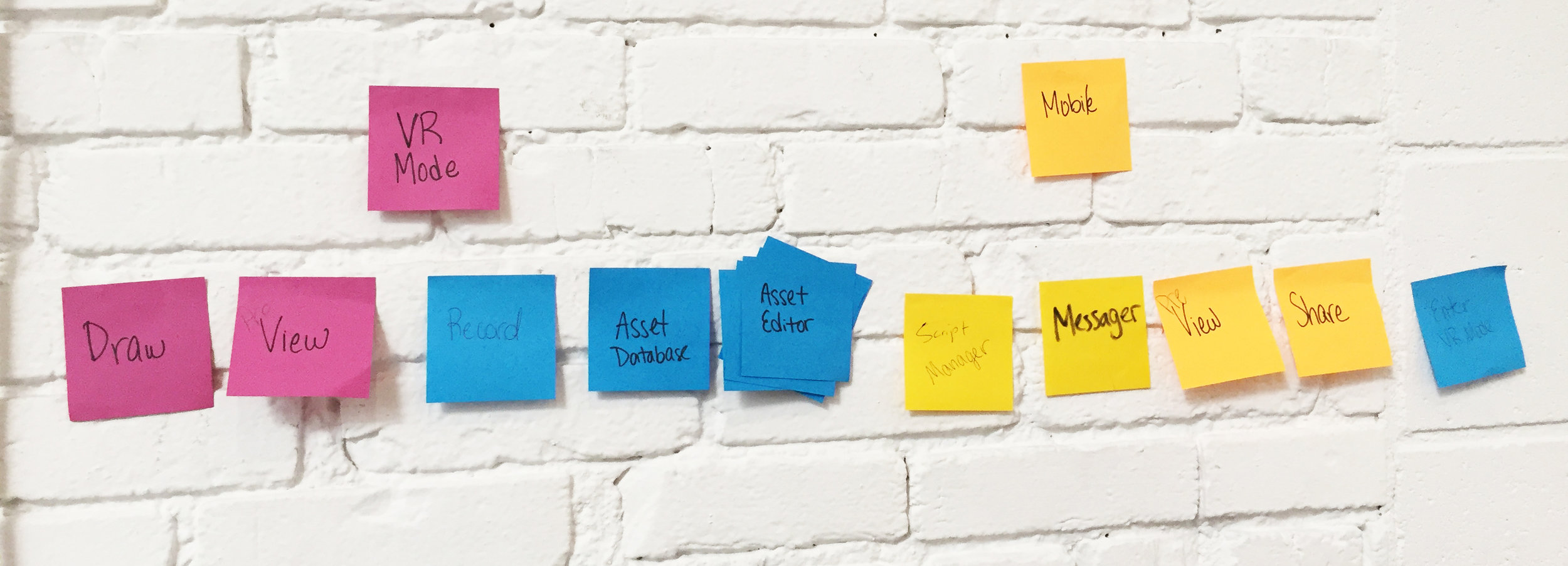
Our team CARD SORTED on post it notes to ideate the user's journey, the information architecture, and navigation through our app.
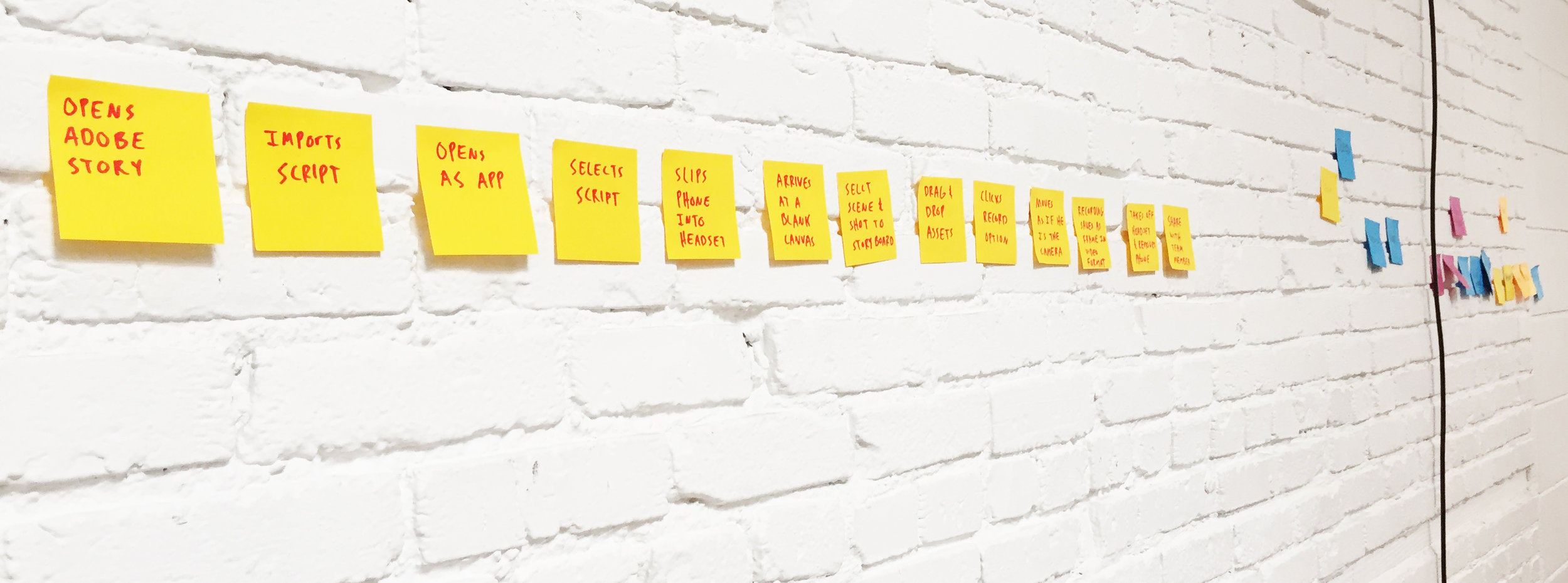
Based on information gathered from the user interviews and card sorting, we created a step-by-step journey map that the user would take through our VR app.
An early challenge - Desktop VR vs. Mobile VR
During user interviews, we discovered mobile VR would be an affordable and an accessible alternative to desktop VR; with mobile, the user would not be tethered to a computer requiring high-performing central and graphics processing units. Plus, our end users are always on their feet planning the next shot, running to meetings, and coordinating with various departments on set so mobile makes sense.
While developing the C&C ANALYSIS, a competitive and comparative analysis of similar VR storyboarding applications in the market, we came across Artefact's VR Storyboard experience. This is how we envision our VR storyboarding experience would be...
Again, the video above is Artefact's VR Storyboard experience
Act II: Wireframing
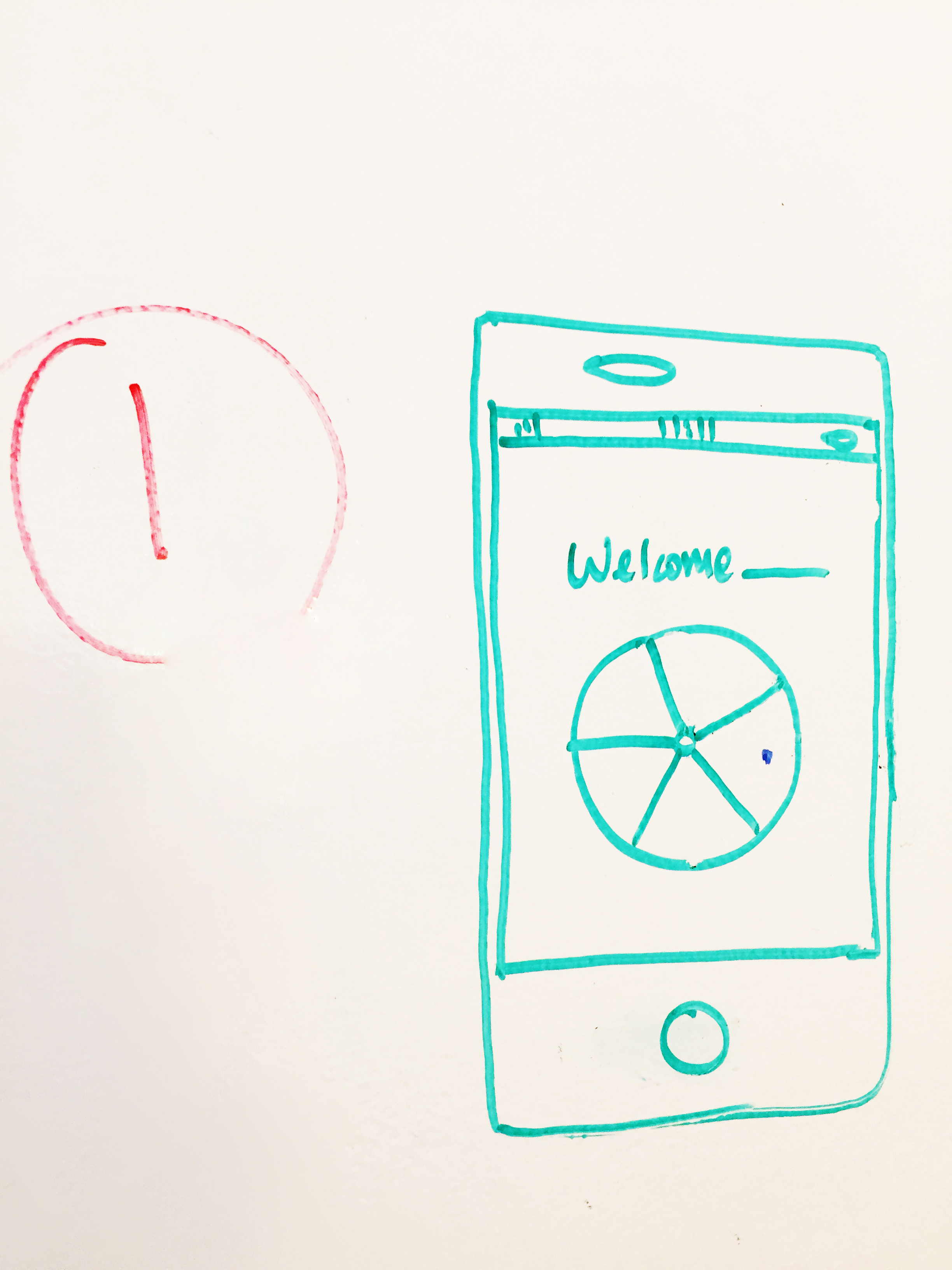
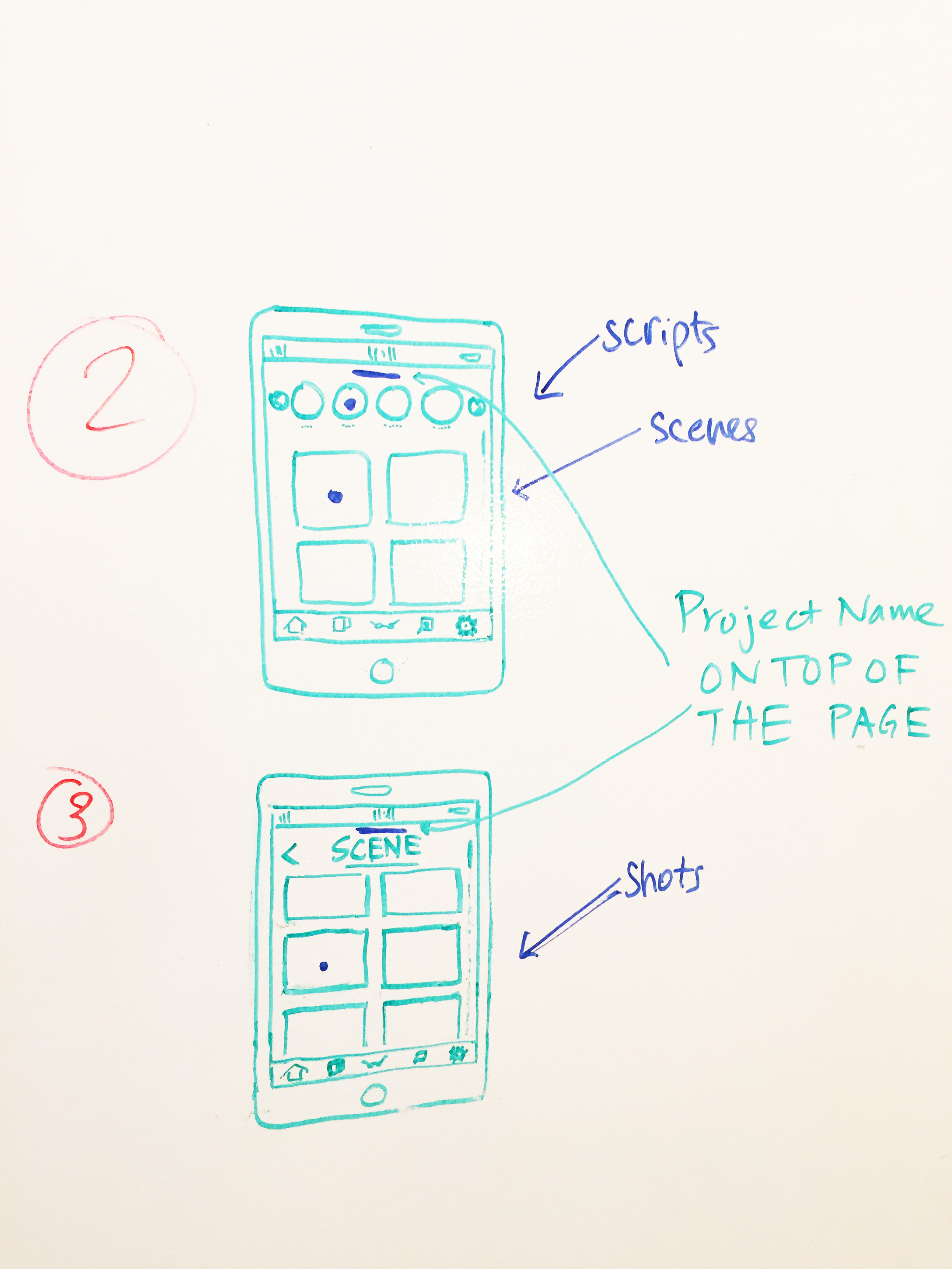
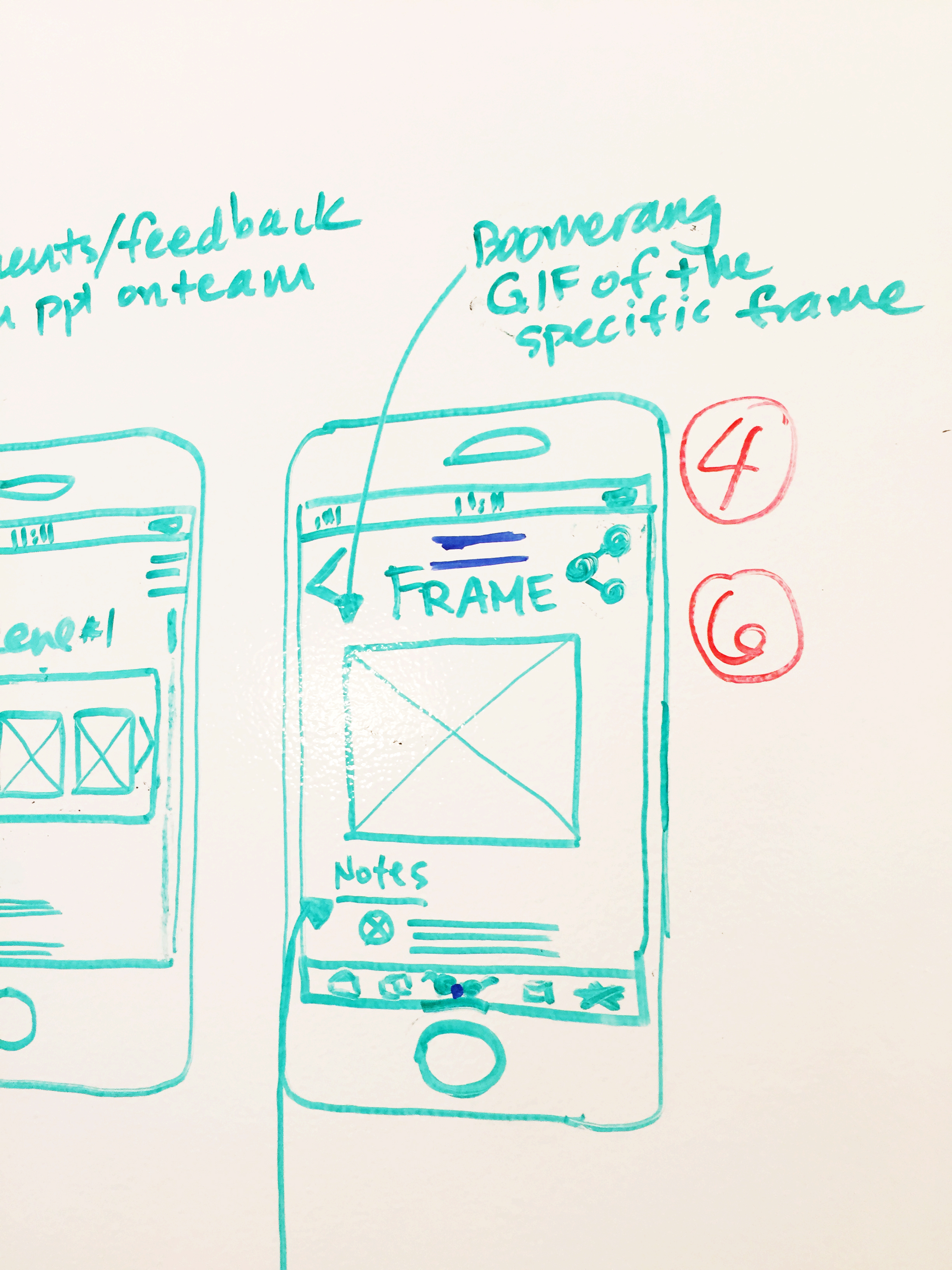
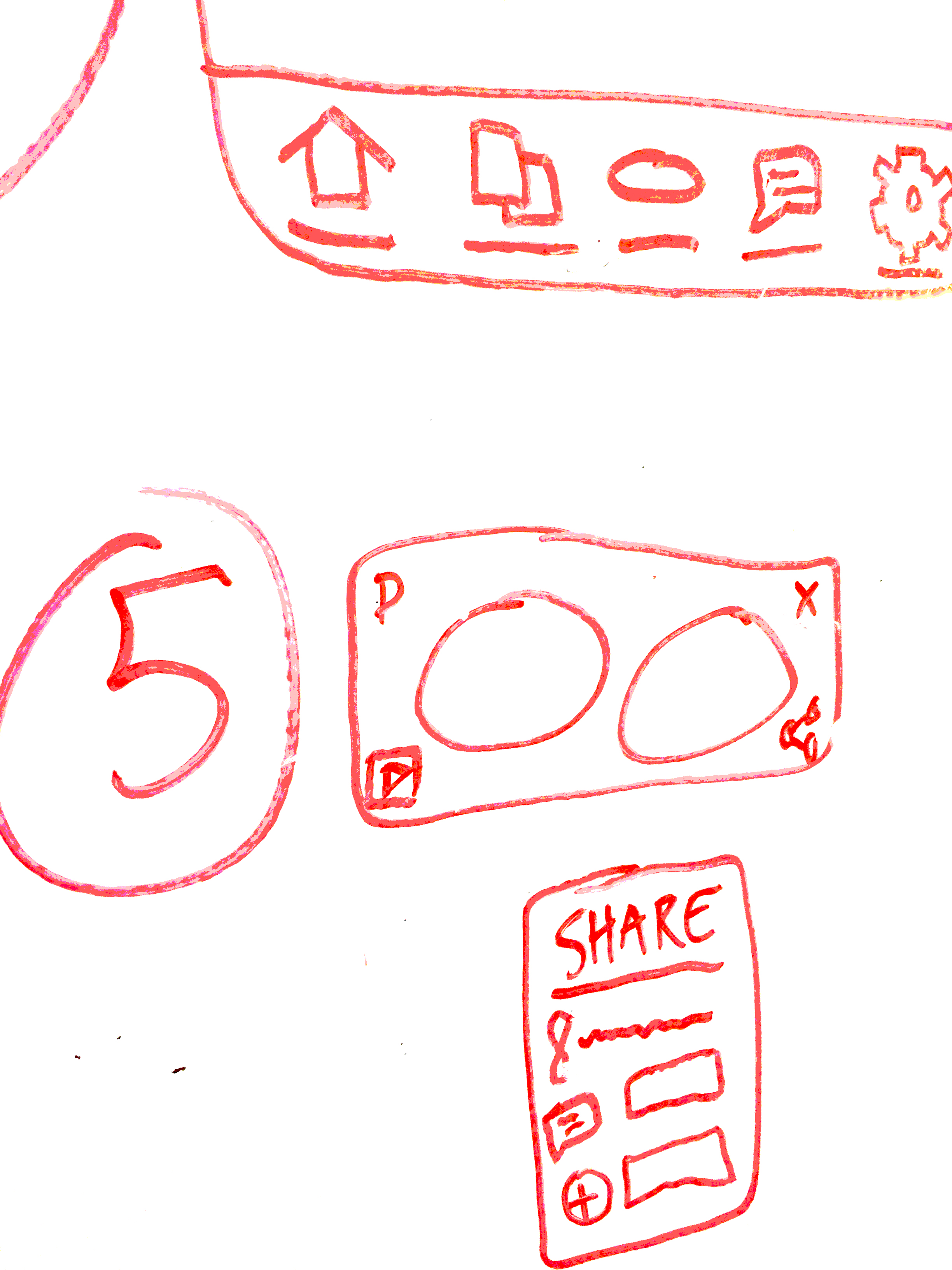
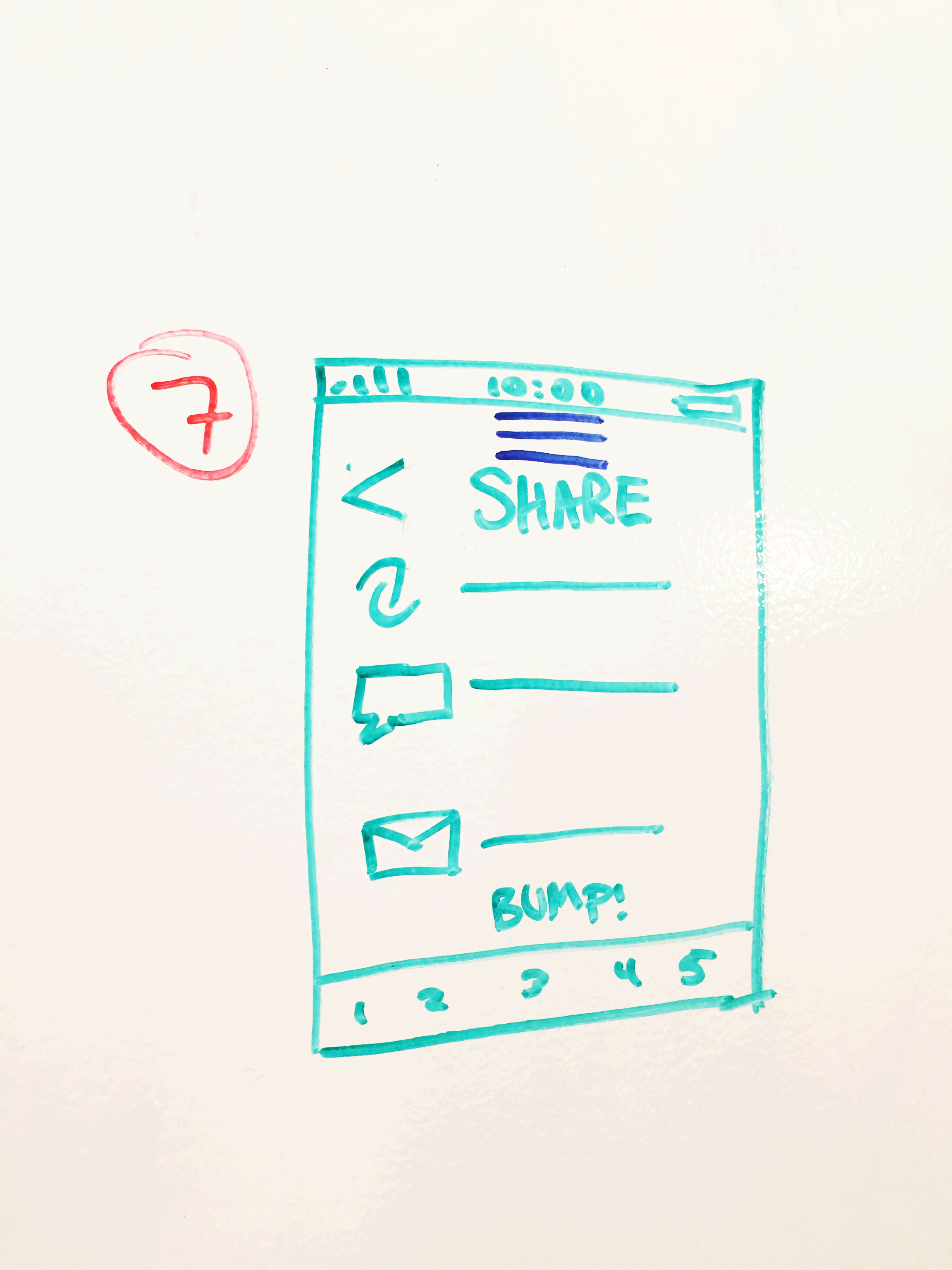
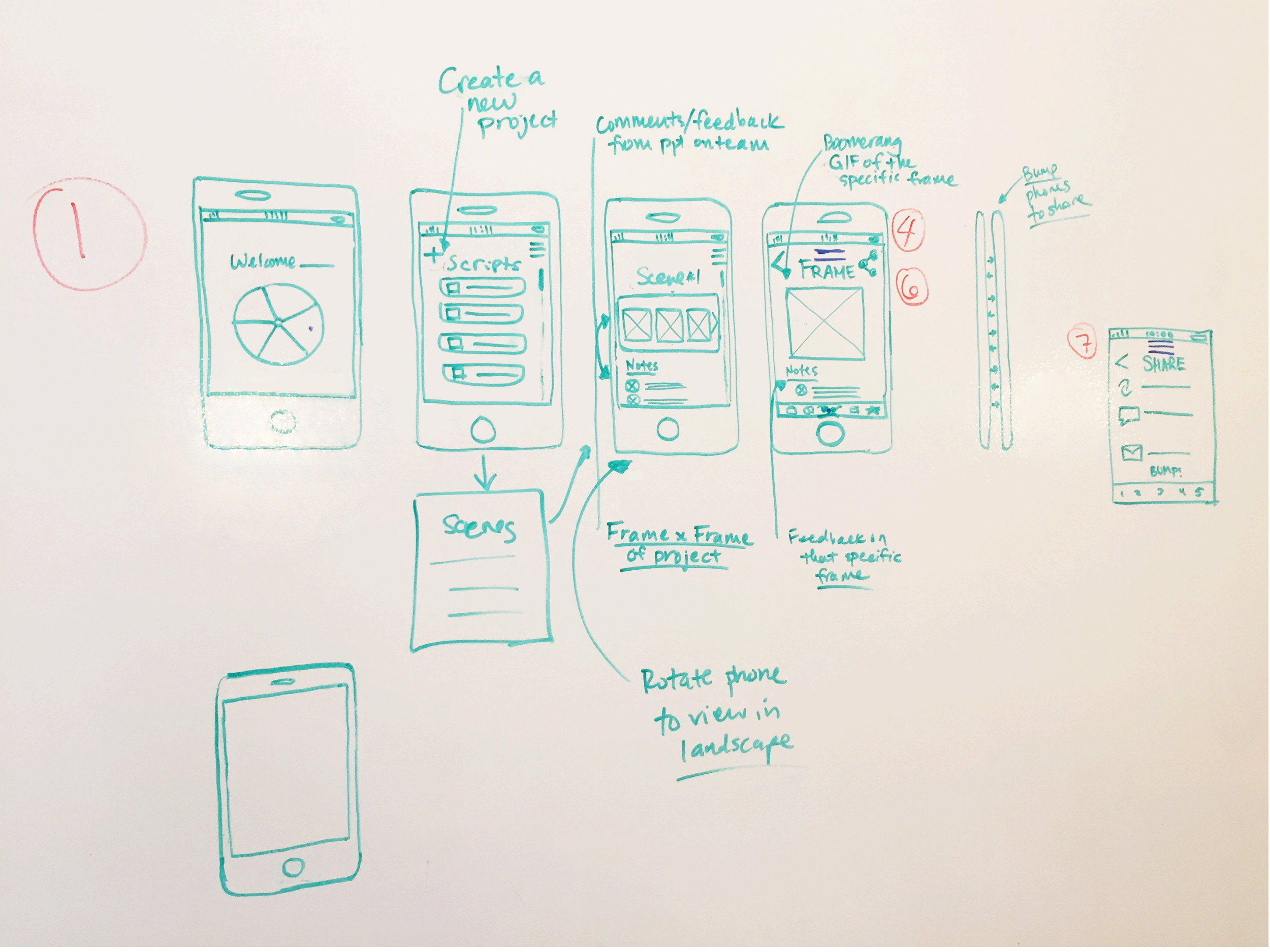
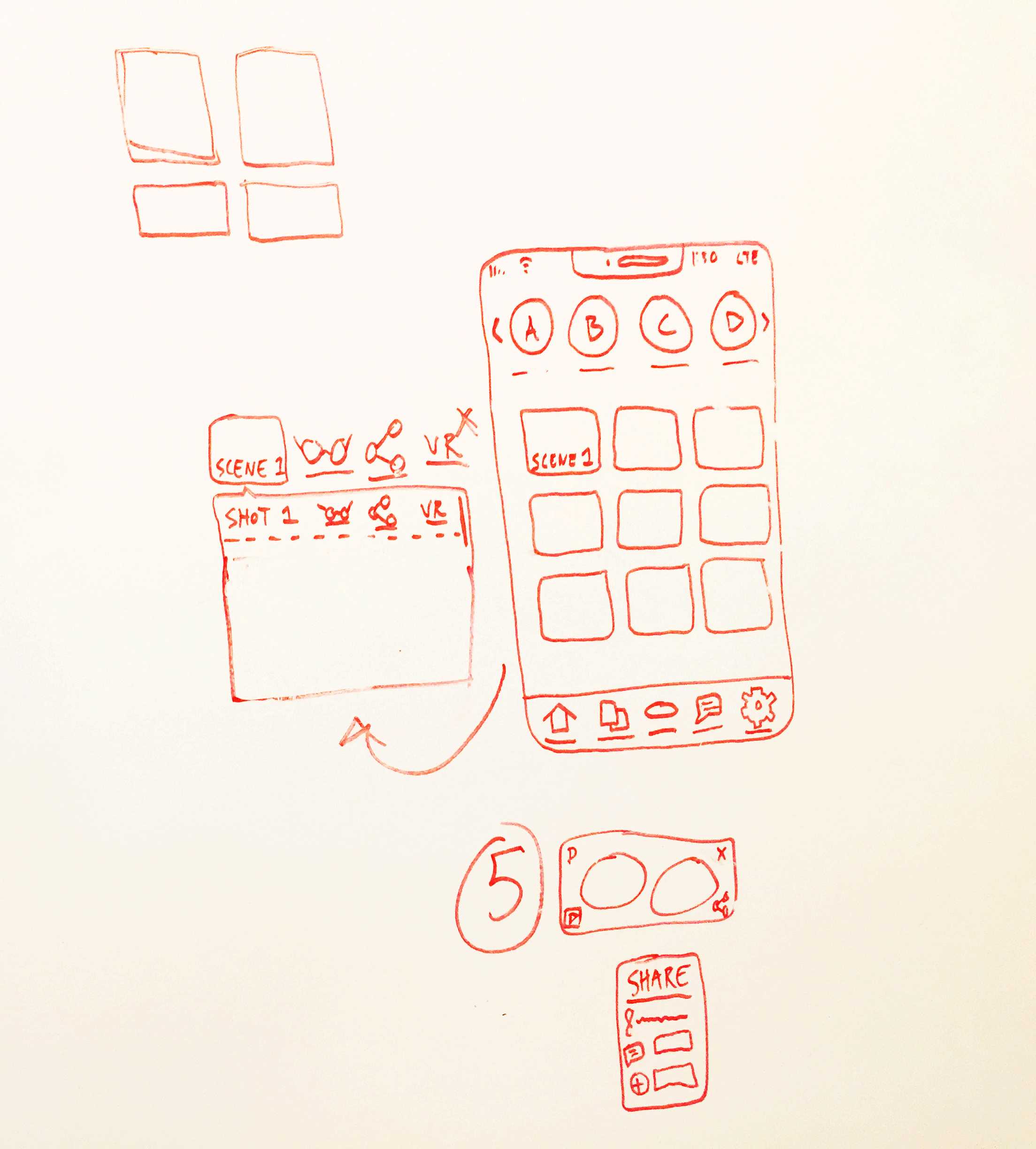
White-boarding
Paper Prototype - which we guerrilla tested with users
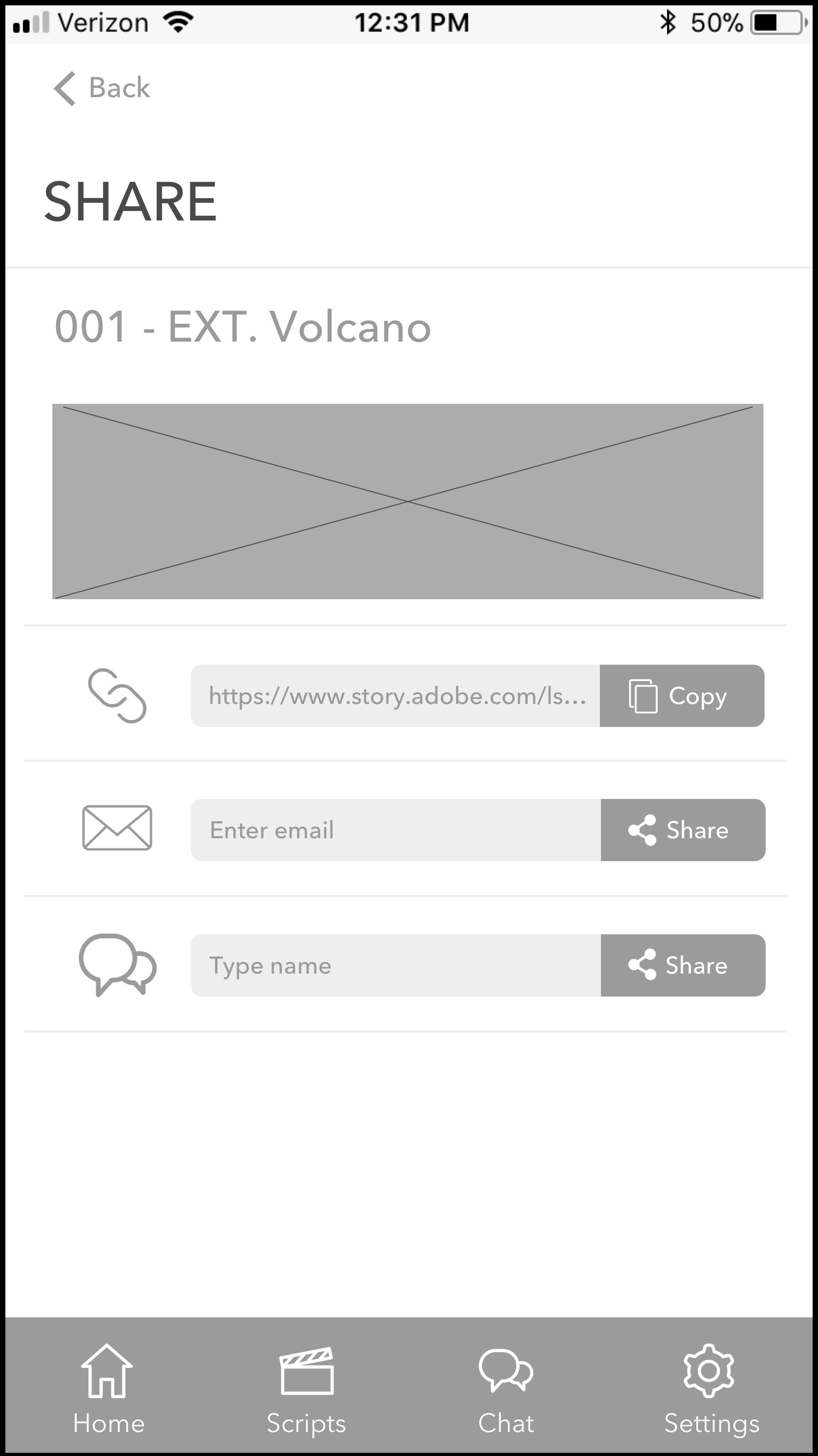
Low Fidelity Wireframes - created on Sketch and further tested with users
Medium Fidelity Wireframes - created on Sketch and then tested with users again
Act III: User Testing & Prototyping
We tested our graph paper sketches, low fidelity wireframes, and medium fidelity wireframes with users through multiple rounds of guerrilla testing and conference calling. We made adjustments and tweaked our product after each test.
Finally, after all the research and testing, we created a clickable PROTOTYPE on InVision. We tested the prototype below with film professionals for feedback and further improvement.
Epilogue: Next Steps
Work with development team to launch the new VR app
Test with new users to find more ways to improve the app and VR experience
Learn about Augmented Reality (AR) to see if there are ways to implement into the app


