

A UX Case Study
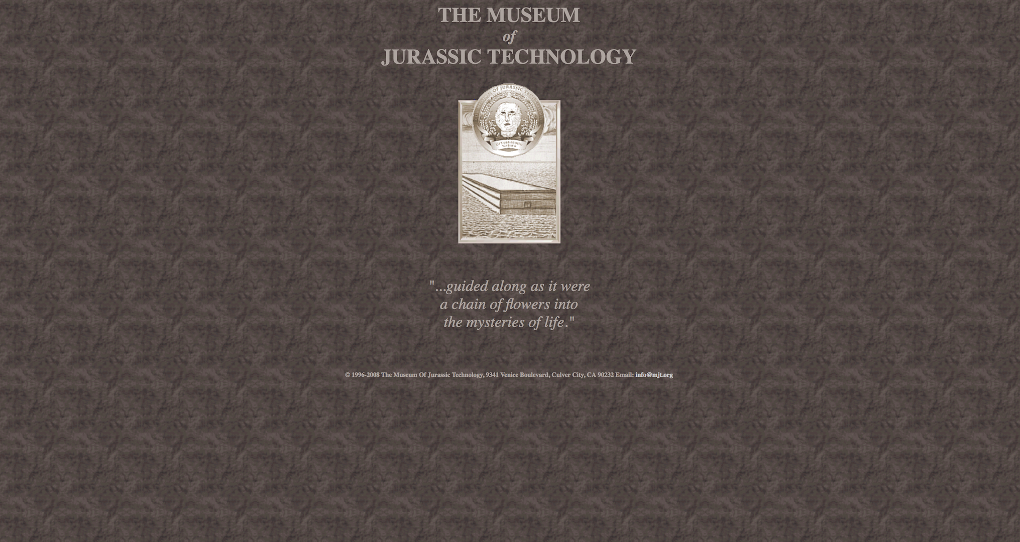
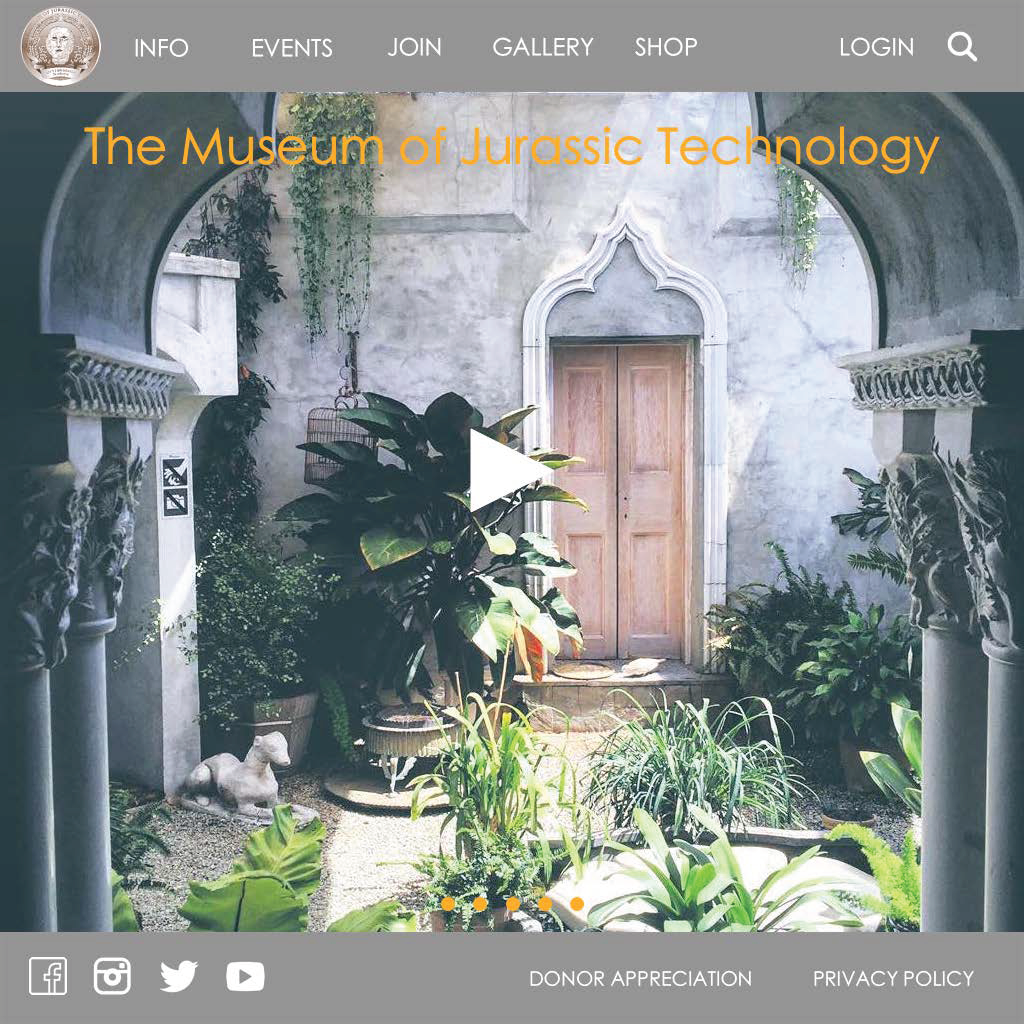
Open to Culver City denizens and anyone with an inquisitive spirit, The Museum of Jurassic Technology displays unconventional pieces from the Lower Jurassic era that demonstrate unusual or curious technological qualities. You can enjoy spending hours in the museum but maybe not so much on their site.
MY ROLE
UX/UI Designer (no team)
CHALLENGES
The website currently has a variety of usability and design issues from the navigation to the checkout process. It currently takes users too many clicks through the vague menu options to find information and purchase items.
METHODOLOGIES
Personas, Guided Interview, Card Sorting, Comparative & Competitive Analysis, User Flow, Usability Testing, Sketches, Wireframes, Prototype
TOOLS
Whiteboard, Pen and Paper, Sketch, InVision, Omnigraffle, Photoshop, Lucidchart


THE PROCESS
As a learning experience, I redesigned the user flow for buying tickets and shopping on MJT.org. How did I get to the final product? Well, let me break it down:
- Analyzed the current site
- Researched the users
- Designed flows, wireframes, Information Architecture (I.A.)
- Tested for usability
To ensure the website's intuitive design and seamless flow, I iterated these steps.
GOALS
Make it easier to:
- Navigate the website
- Purchase tickets online
- Buy items on any device
Analysis
HEURISTIC EVALUATION
Upon analyzing the current site and evaluating with Nielsen's Heuristics, I discovered four issues, the current website:
- Violates flexibility and efficiency of use with too many steps and text heavy pages
- Lacks visual affordances to guide users when entering the site's confusing splash page and so forth
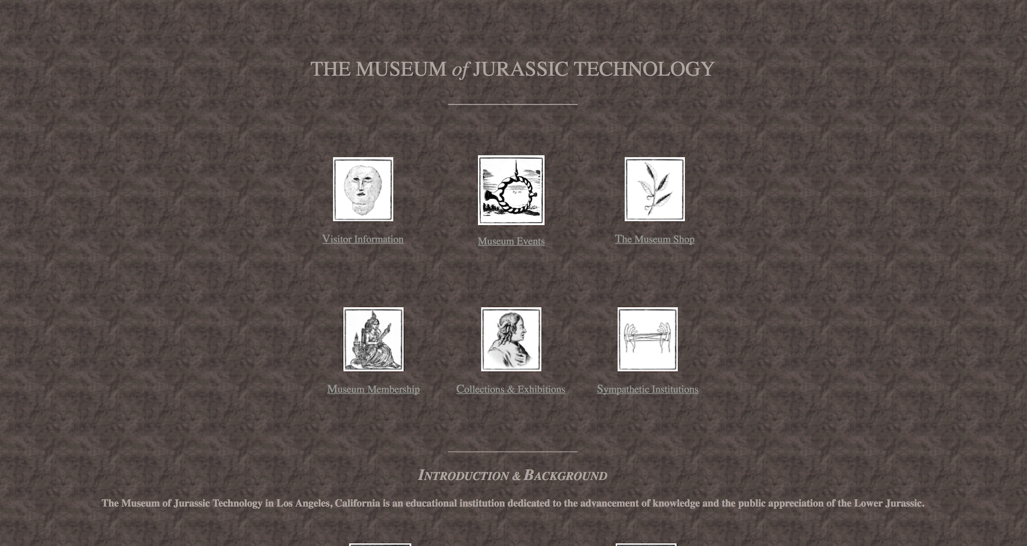
- Has no global navigation, instead there are menu options with unclear icons on the Homepage
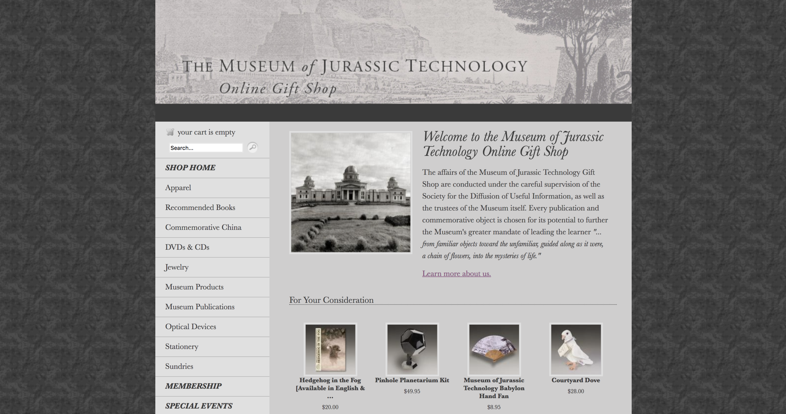
- Is inconsistent - 2 separate domains, some pages link to MJT.org and others lead to MJTGiftShop.org, both have different styles
COMPETITIVE & COMPARATIVE ANALYSIS
By using this method, I gained insight into how other museums designed their e-commerce experiences. This process led me to understand the industry standard while providing a clear direction for the redesign, like what features needed improvement and enhancement for a user-friendly web experience.
TASK ANALYSIS
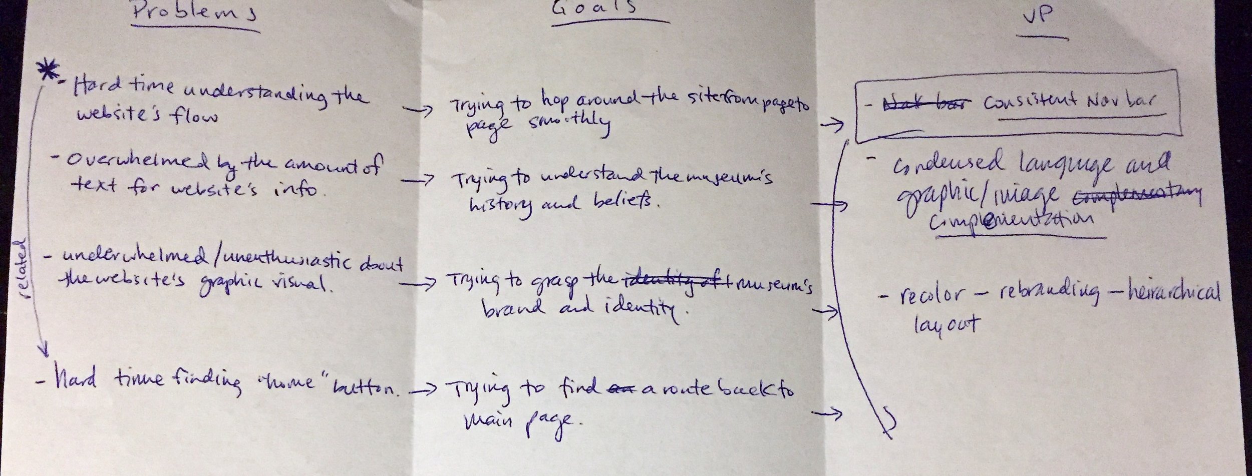
Reaching out to different users, I gave them a task and observed their behavior as they navigated through the current site. I immediately learned their goals, behavior, and pain points. My previous assumptions on the usability and function were both validated and disproved. From the data collected, I was able to create a USER JOURNEY to help visualize the user's current website experience.
To begin resolving these issues, I researched WHO these problems affected.
Research
USER INTERVIEWS
After interviewing users and MJT-goers, I quickly learned about their goals and behaviors. Therefore, I created a persona representing real users in order for me to empathize with my users and focus on designing solutions to their needs.
MEET DEMETRIUS BOOTH
Age: 27
Location: Culver City, CA
Occupation: Freelance Graphic Designer and Model
Background: An LA native. Has a passion for exploring LA. Loves keeping an open mind. Has an appreciation for art, museums, and photography.
Habits and Behaviors: Loves collecting small trinkets and items from local shops. Prefers to visit and support local businesses. Has a girlfriend who shares the same interest to explore and get a little lost. Flexibly surfs the web on his desktop, laptop, and mobile device. Has patience for people but not technology.
After stumbling upon The Museum of Jurassic Technology, he wants to buy a gift for his girlfriend online and pick it up during his next visit to the museum.

Design & Test
I.A.
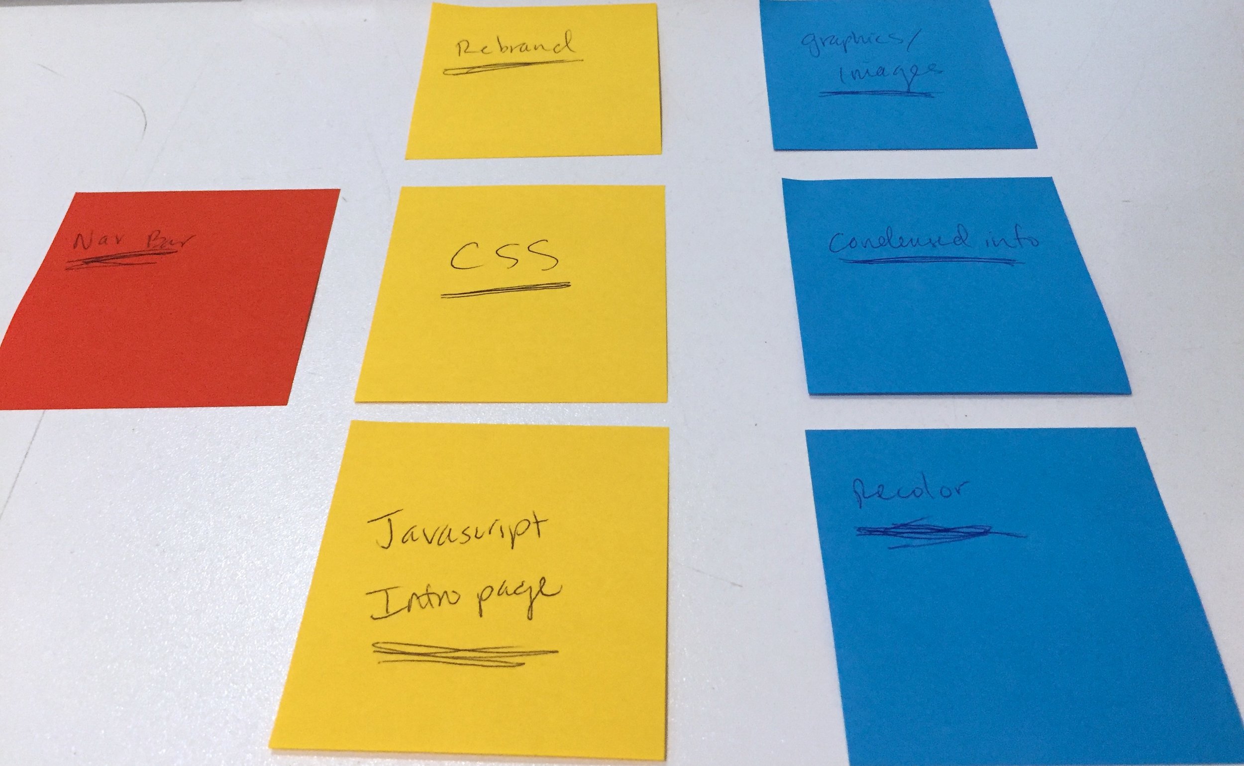
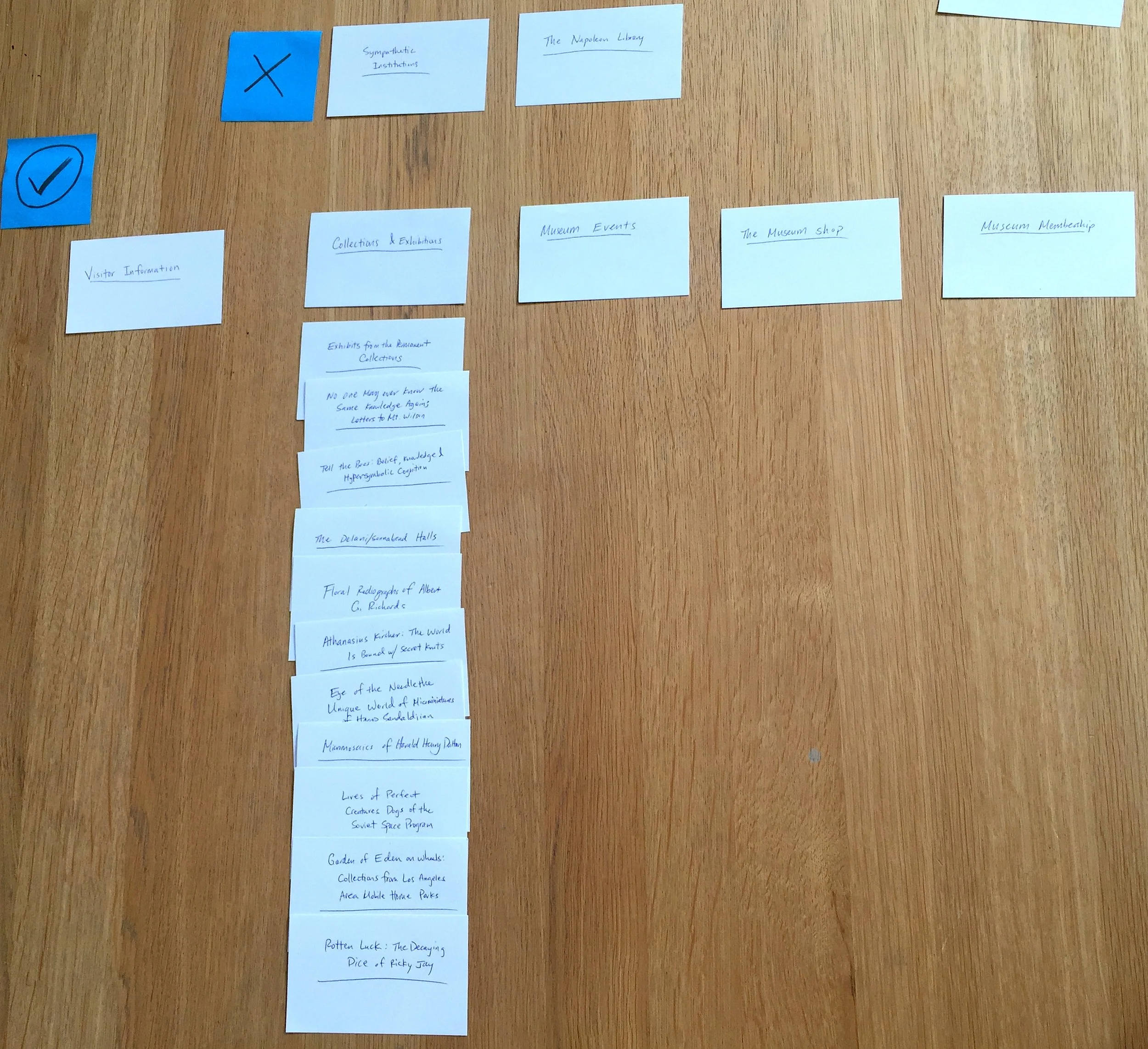
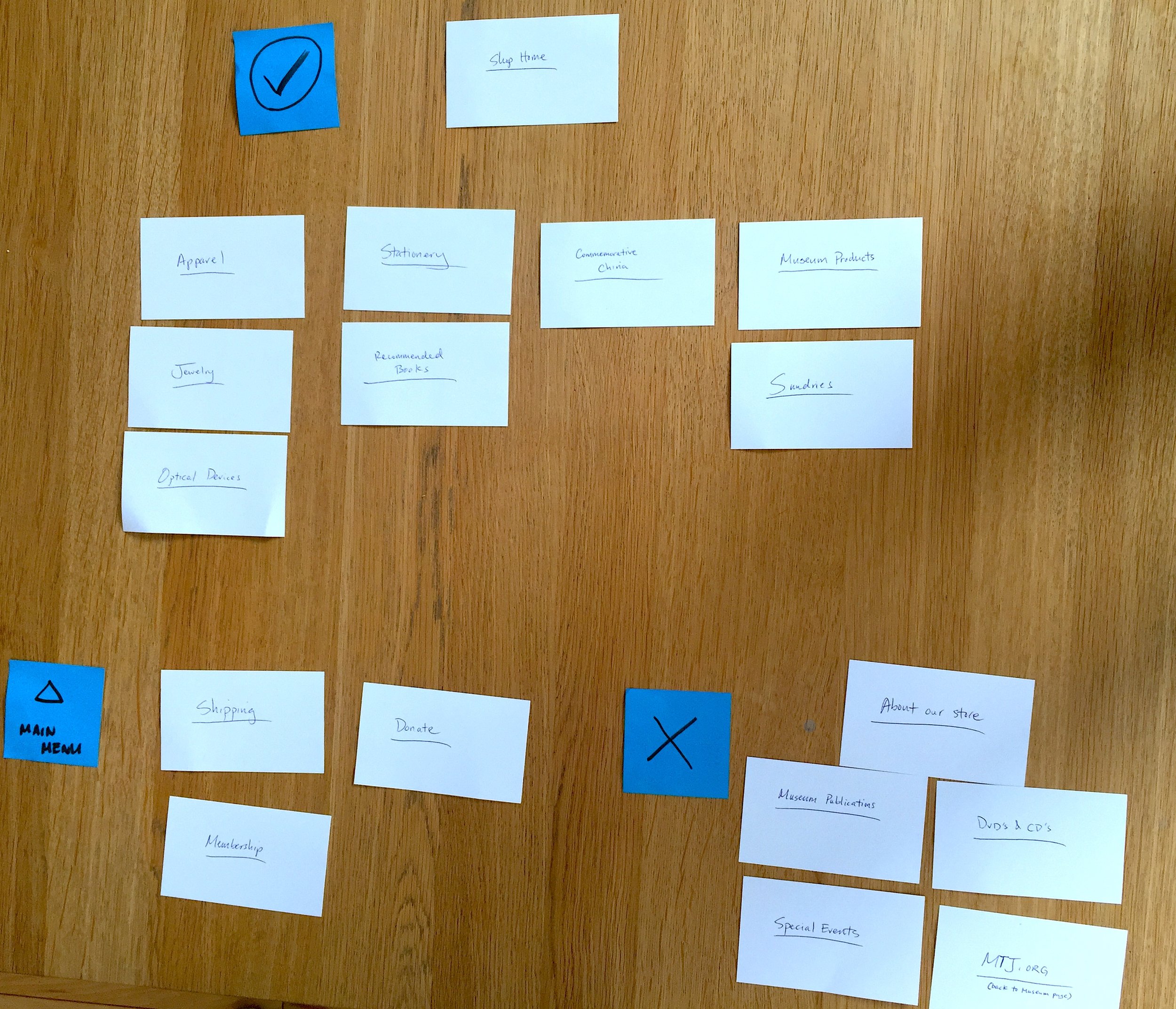
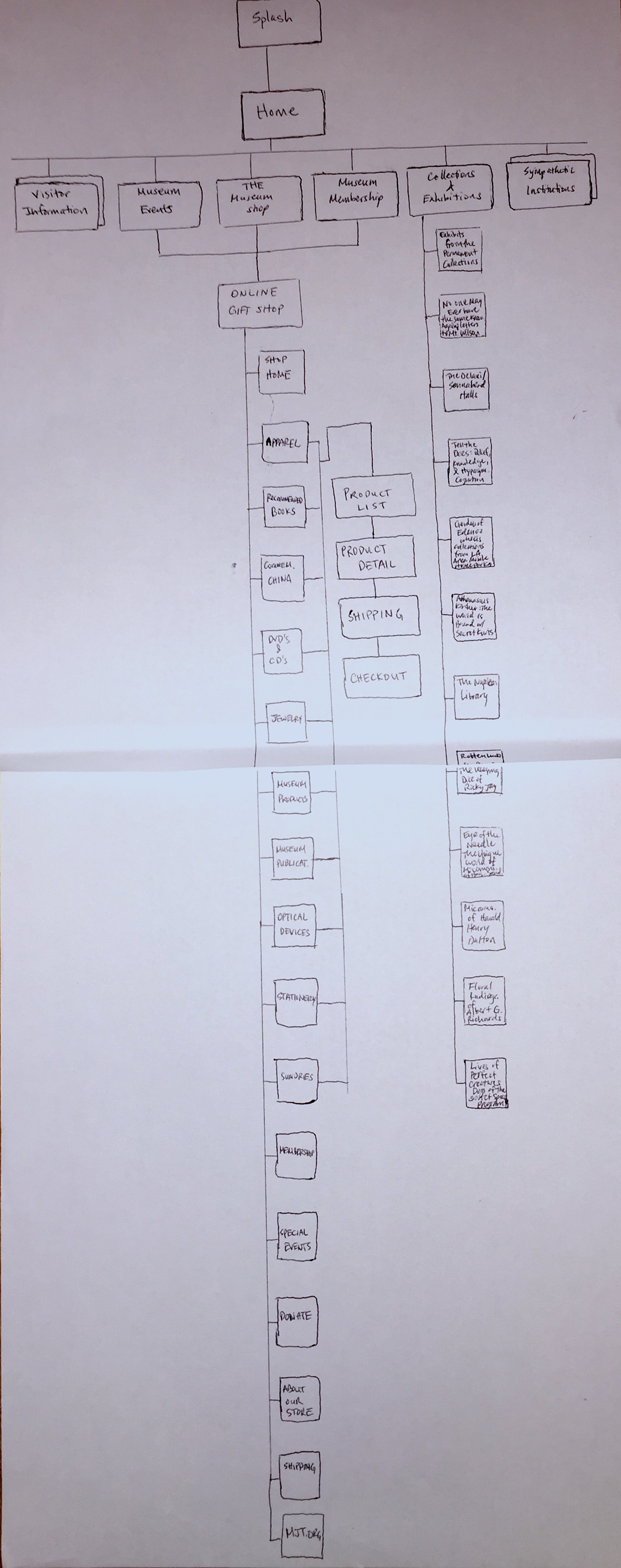
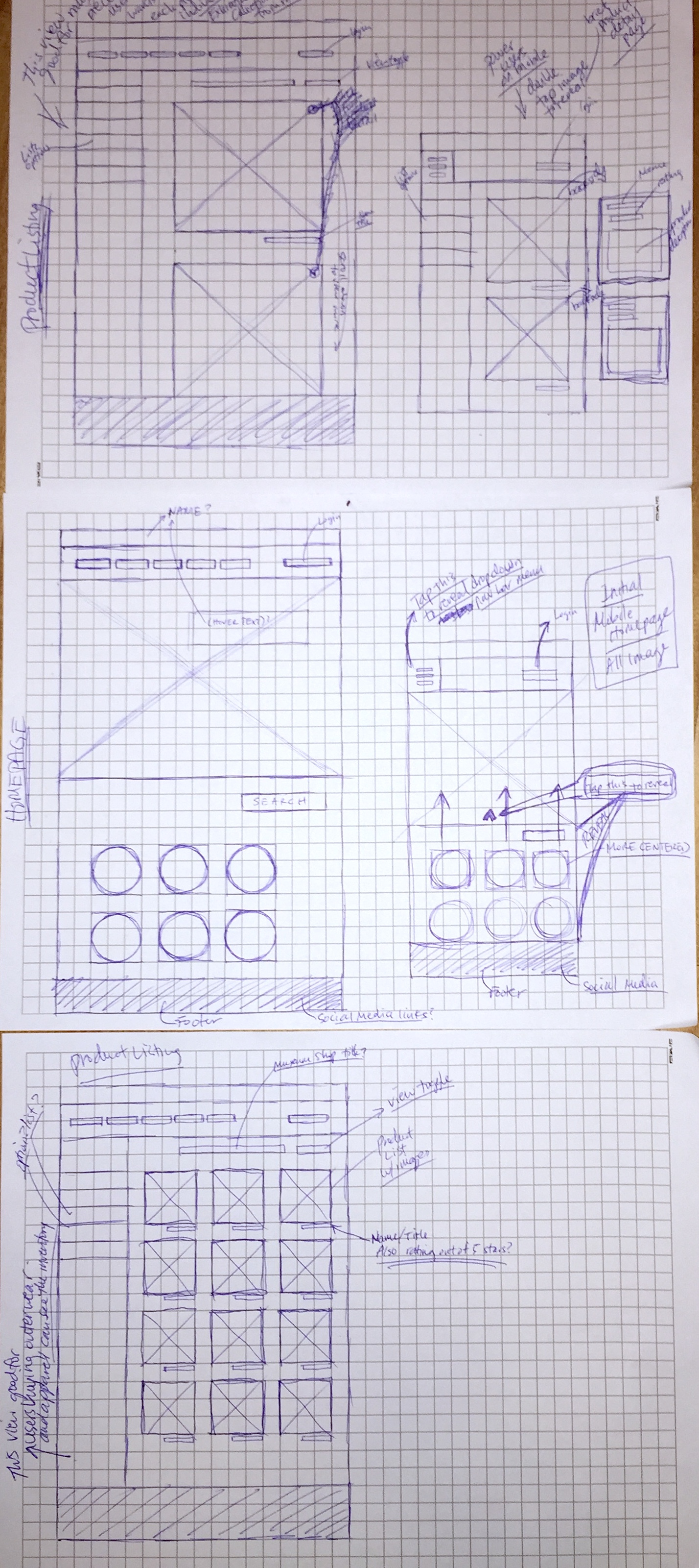
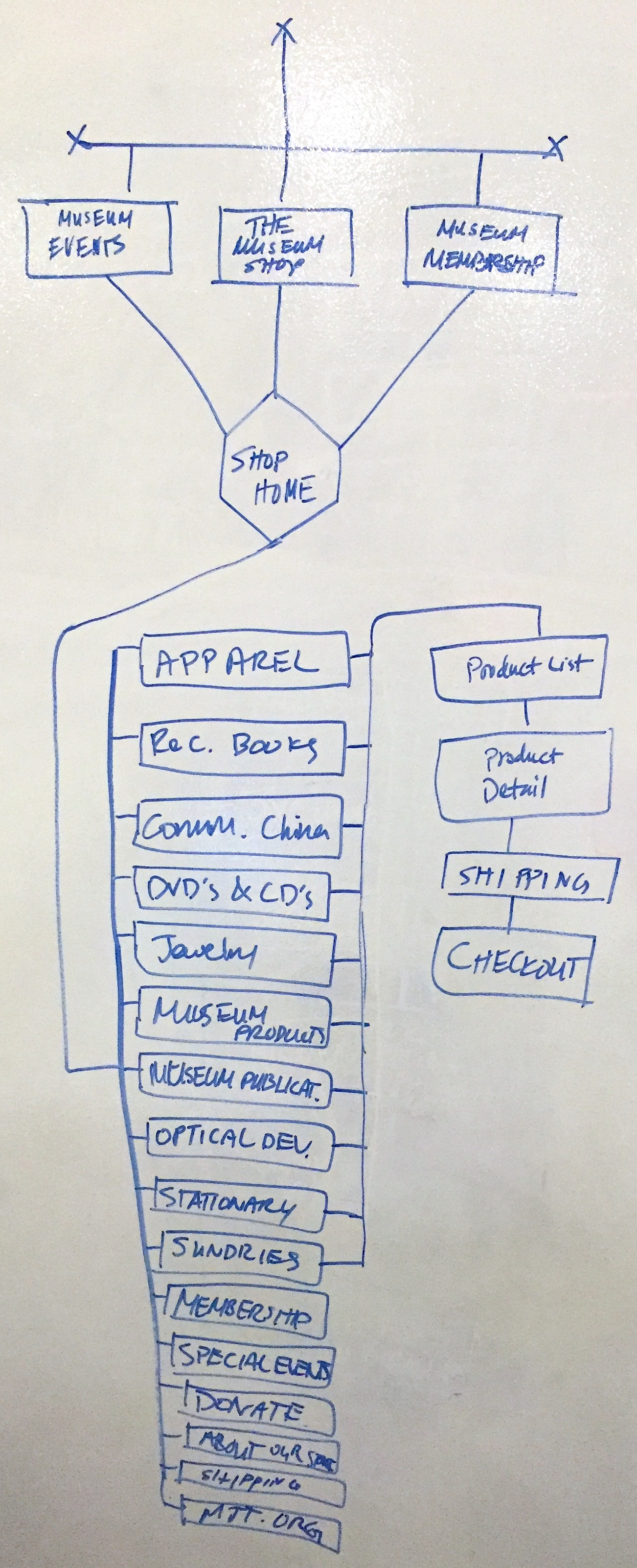
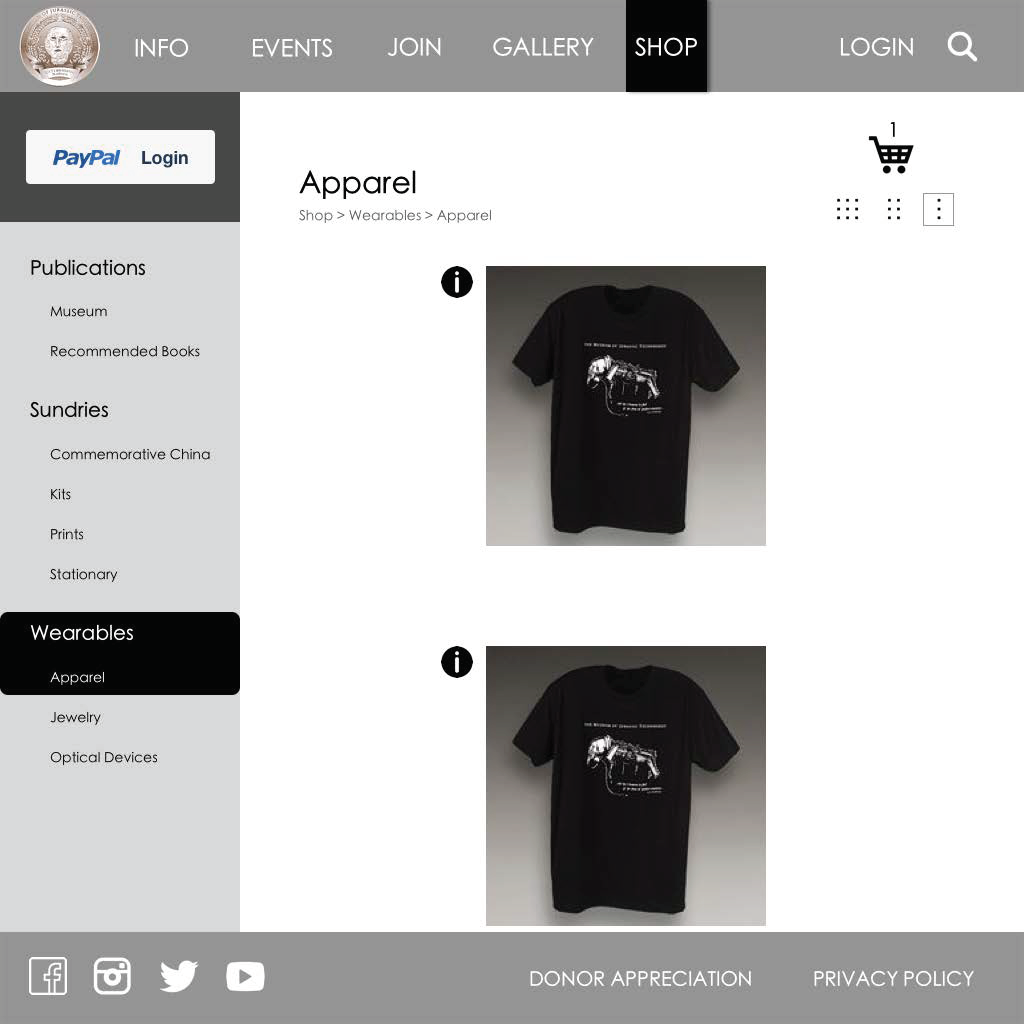
It was crucial to understand the site's information architecture in order to propose a streamlined SITE MAP. After white-boarding and sketching the site's current flow, I better understood Demetrius' pain points and began to think about how to solve his needs. By CARD SORTING the current navigational categories with different users, I was able to objectively conclude which categories to include and remove for the redesign.


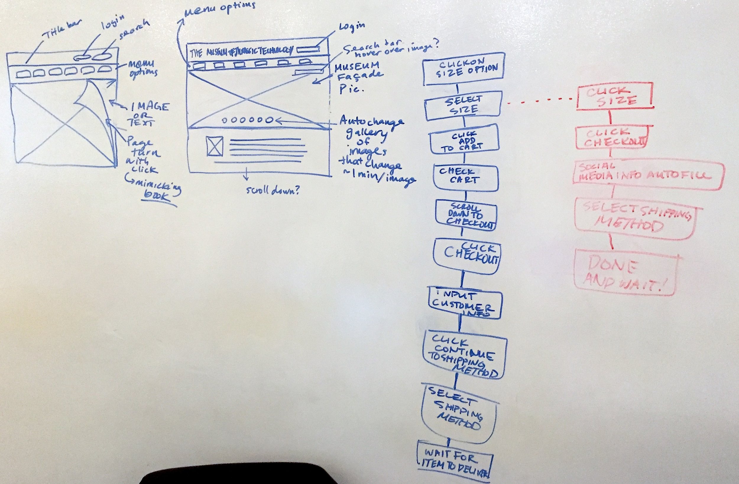


WIREFRAMES AND PROTOTYPES
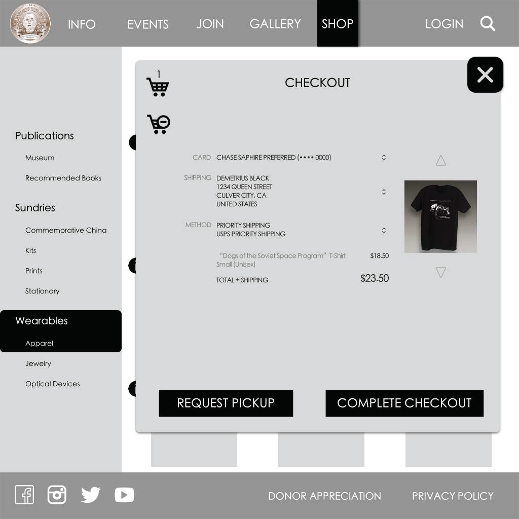
With so much insight into Demetrius' goals, motivations, and needs, I began to sketch wireframes for the improved site. After converting to medium and high fidelity, I organized USABILITY TESTS to further improve the look and feel of the site. While testing, I made sure to receive feedback on the Request Pickup feature. While I wanted to motivate users to visit the museum, I didn't want to add an extra step in their checkout process if it wasn't beneficial and immediately understandable.

USABILITY TESTS - ITERATE, ITERATE, ITERATE!
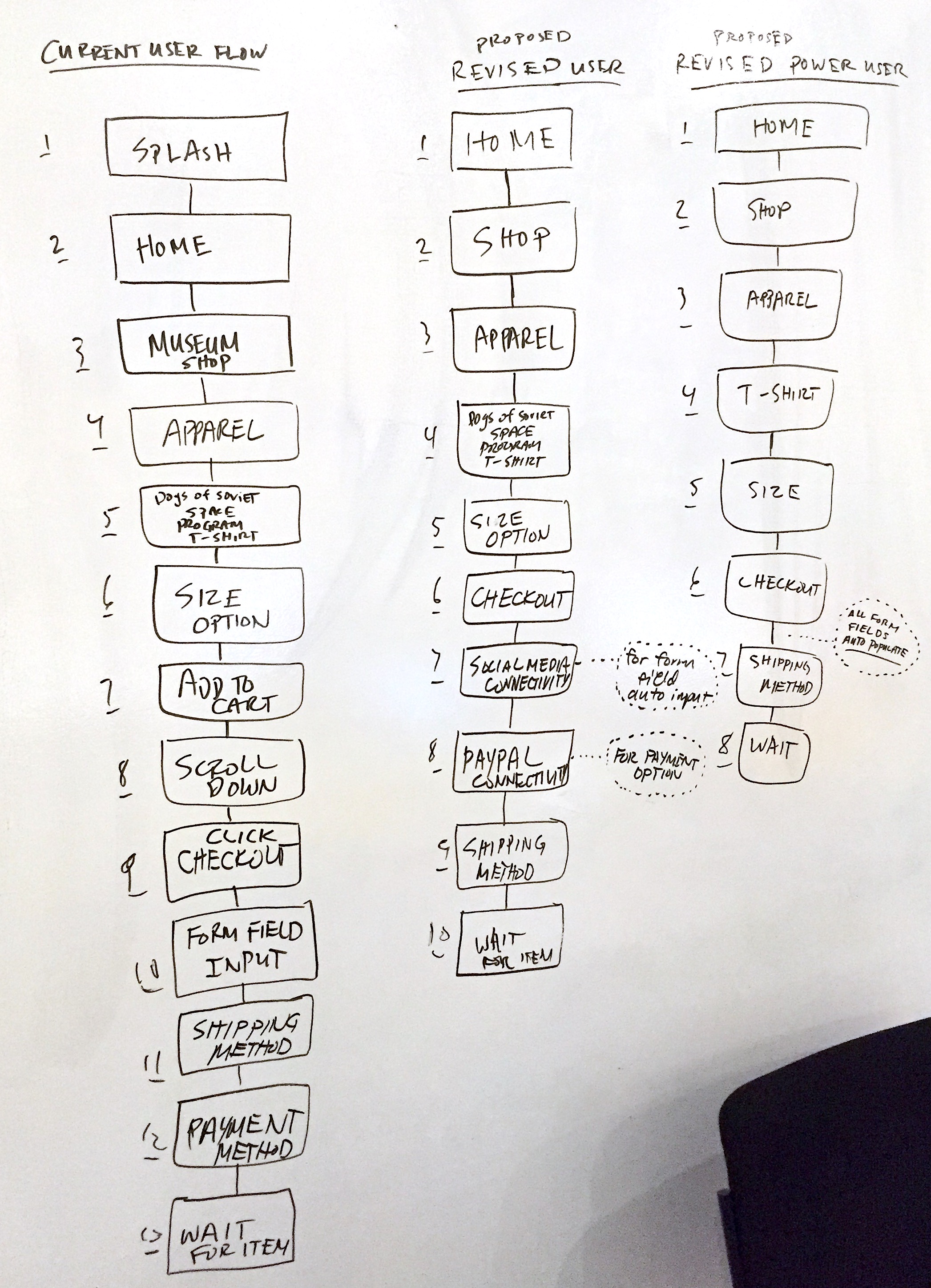
By testing my medium and high fidelity prototypes with users, I found that many had a hard time understanding the shop's flow. So I went back to the drawing board and designed an e-commerce experience that implements the 3-step check out process. I also received feedback for the aesthetics. I added clear bread crumbs so that users knew exactly where they were every step of the way. In regards to the UI design, I wanted to respect the company's brand and style. Consequently, I played around with muted colors in order to maintain the mystique and intrigue that MJT evokes.

TAKEAWAYS
- A simple site map fosters a seamless experience
- Bread crumbs help users know where they are
- Users prefer the 3 step checkout process
NEXT STEPS
- Work with developers to bring life to the site and shop
- Further implement this redesign strategy on more pages
- Track the website's analytics to observe performance and user behavior